Art History Titles

Prehistoric Art (~40,000–4,000 B.C.)

The origins of art history can be traced back to the Prehistoric era, before written records were kept. The earliest artifacts come from the Paleolithic era, or the Old Stone Age, in the form of rock carvings, engravings, pictorial imagery, sculptures, and stone arrangements.

Art from this period relied on the use of natural pigments and stone carvings to create representations of objects, animals, and rituals that governed a civilization’s existence. One of the most famous examples is that of the Paleolithic cave paintings found in the complex caves of Lascaux in France. Though discovered in 1940, they’re estimated to be up to 20,000 years old and depict large animals and vegetation from the area.

Ancient Art (4,000 B.C.–A.D. 400)

A picture containing photo, stone

Description automatically generated

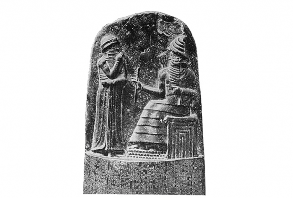
Unknown, Code of Hammurabi, circa 1792 and circa 1750 B.C. Image via Wikimedia Commons.

Ancient art was produced by advanced civilizations, which in this case refers to those with an established written language. These civilizations included Mesopotamia, EgyptGreece, and those of the Americas.

The medium of a work of art from this period varies depending on the civilization that produced it, but most art served similar purposes: to tell stories, decorate utilitarian objects like bowls and weapons, display religious and symbolic imagery, and demonstrate social status. Many works depict stories of rulers, gods, and goddesses.

One of the most famous works from ancient Mesopotamia is the Code of Hammurabi. Created around 1792 B.C., the piece bears a Babylonian set of laws carved in stone, adorned by an image of King Hammurabi—the sixth King of Babylonia—and the Mesopotamian god, Shabash.

Medieval Art (500–1400)

02-medieval-martini

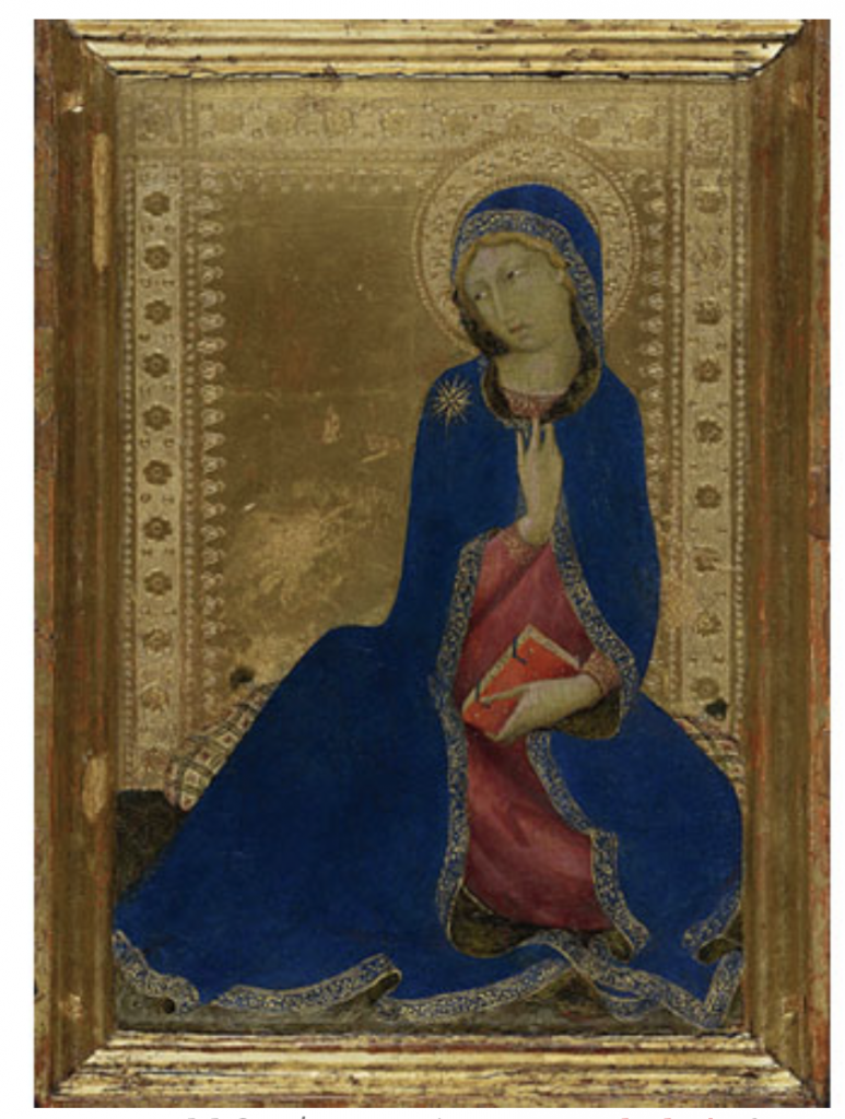
Simone Martini. Sold for $4,114,500 via Sotheby’s (January 2012).

The Middle Ages, often referred to as the “Dark Ages,” marked a period of economic and cultural deterioration following the fall of the Roman Empire in 476 A.D. Much of the artwork produced in the early years of the period reflects that darkness, characterized by grotesque imagery and brutal scenery. Art produced during this time was centered around the Church. As the first millennium passed, more sophisticated and elaborately decorated churches emerged; windows and silhouettes were adorned with biblical subjects and scenes from classical mythology.

This period was also responsible for the emergence of the illuminated manuscript and Gothic architecture style. Definitive examples of influential art from this period include the catacombs in Rome, Hagia Sophia in Istanbul, the Lindisfarne Gospels, one of the best-known examples of the illuminated manuscript, and Notre Dame, a Parisian cathedral and prominent example of Gothic architecture.

Renaissance Art (1400–1600)

03-renaissance-raphael

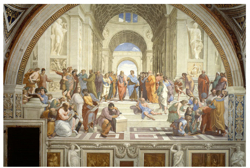
Raffaello Sanzio da Urbin, The School of Athens, 1511. Image via Wikimedia Commons.

This style of painting, sculpture, and decorative art was characterized by a focus on nature and individualism, the thought of man as independent and self-reliant. Though these ideals were present in the late Medieval period, they flourished in the 15th and 16th centuries, paralleling social and economic changes like secularization.

The Renaissance reached its height in Florence, Italy, due in large part to the Medici, a wealthy merchant family who adamantly supported the arts and humanism, a variety of beliefs and philosophies that places emphasis on the human realm. Italian designer Filippo Brunelleschi and sculptor Donatello were key innovators during this period.

The High Renaissance, which lasted from 1490 to 1527, produced influential artists such as da Vinci, Michelangelo, and Raphael, each of whom brought creative power and spearheaded ideals of emotional expression. Artwork throughout the Renaissance was characterized by realism, attention to detail, and precise study of human anatomy. Artists used linear perspective and created depth through intense lighting and shading. Art began to change stylistically shortly after the High Renaissance, when clashes between the Christian faith and humanism gave way to Mannerism.

Mannerism (1527–1580)

People around each other

Description automatically generated

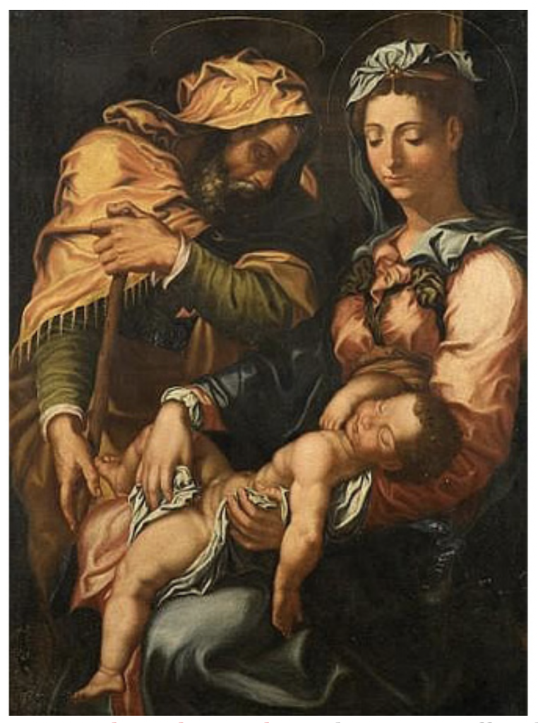
Follower of Giorgio Vasari, The Holy Family, 17th century. Offered for €6,000 – 8,000 via Artcurial (May 2010).

Mannerist artists emerged from the ideals of Michelangelo, Raphael, and other Late Renaissance artists, but their focus on style and technique outweighed the meaning of the subject matter. Often, figures had graceful, elongated limbs, small heads, stylized features and exaggerated details. This yielded more complex, stylized compositions rather than relying on the classical ideals of harmonious composition and linear perspective used by their Renaissance predecessors.

Some of the most celebrated Mannerist artists include Giorgio Vasari, Francesco Salviati, Domenico Beccafumi, and Bronzino, who is widely considered to be the most important Mannerist painter in Florence during his time.

Baroque (1600–1750)

05-baroque-rembrandt

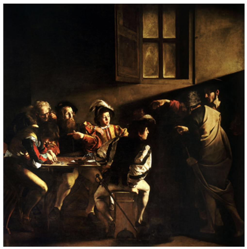
Caravaggio, The Calling of Saint Matthew, circa 1599-1600. Image via Wikimedia Commons.

The Baroque period that followed Mannerism yielded ornate, over-the-top visual arts and architecture. It was characterized by grandeur and richness, punctuated by an interest in broadening human intellect and global discovery. Baroque artists were stylistically complex.

Baroque paintings were characterized by drama, as seen in the iconic works of Italian painter Caravaggio and Dutch painter Rembrandt. Painters used an intense contrast between light and dark and had energetic compositions matched by rich color palettes.

Rococo (1699–1780)

06-rococo-watteau

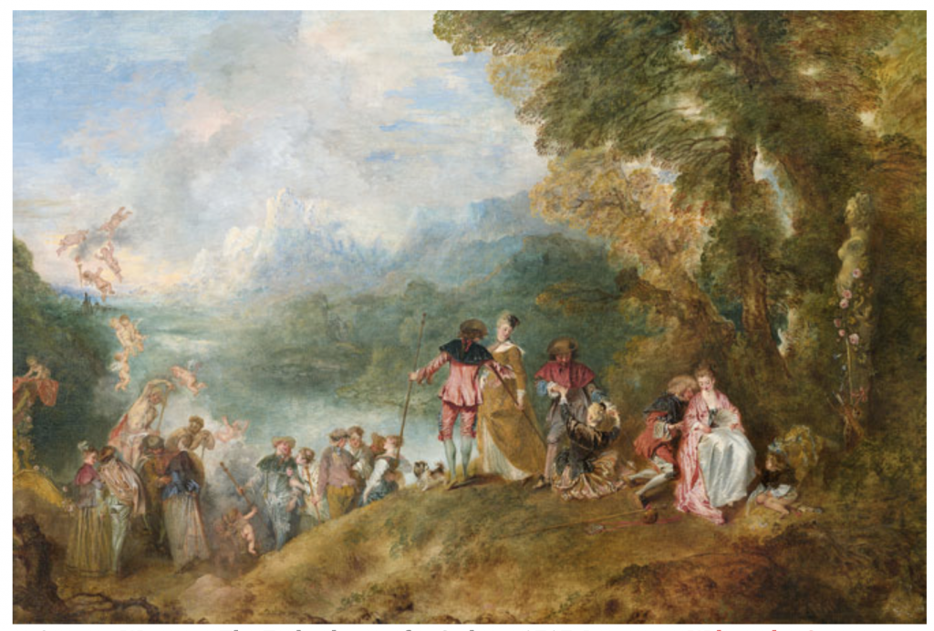
Antoine Watteau, The Embarkation for Cythera 1717. Image via Wikimedia Commons.

Rococo originated in Paris, encompassing decorative art, painting, architecture, and sculpture. The aesthetic offered a softer style of decorative art compared to Baroque’s exuberance. Rococo is characterized by lightness and elegance, focusing on the use of natural forms, asymmetrical design, and subtle colors.

Painters like Antoine Watteau and Francois Boucher used lighthearted treatments, rich brushwork, and fresh colors. The Rococo style also easily translated to silver, porcelain, and French furniture. Many chairs and armoires featured curving forms, floral designs, and an expressive use of gilt.

Neoclassicism (1750–1850)

07-neoclassicism-david

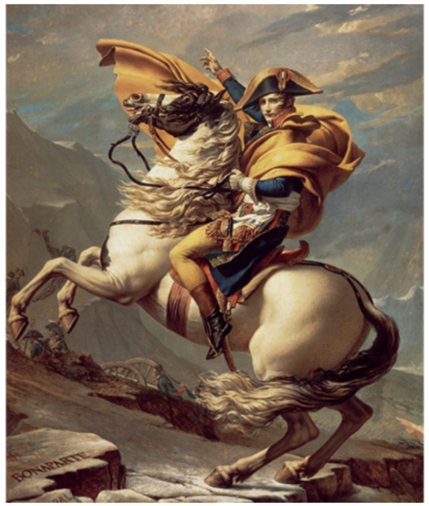
Jacques-Louis David, Napoleon Crossing the Alps, 1801. Image via Wikimedia Commons.

As its name suggests, the Neoclassical period drew upon elements from classical antiquity. Archaeological ruins of ancient civilizations in Athens and Naples that were discovered at the time reignited a passion for all things past, and artists strove to recreate the great works of ancient art. This translated to a renewed interest in classical ideals of harmony, simplicity, and proportion.

Neoclassical artists were influenced by classical elements; in particular, a focus on idealism. Inevitably, they also included modern, historically relevant depictions in their works. For example, Italian sculptor Antonio Canova drew upon classical elements in his marble sculptures, but avoided the cold artificiality that was represented in many of these early creations.

Romanticism (1780–1850)

A picture containing photo, different, person

Description automatically generated

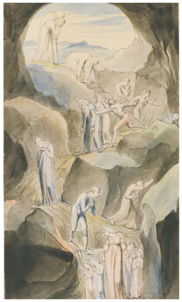
William Blake, The Descent of Man into the Vale of Death. Sold for $225,000 via Sotheby’s (January 2016).

Romanticism embodies a broad range of disciplines, from painting to music to literature. The ideals present in each of these art forms reject order, harmony, and rationality, which were embraced in both classical art and Neoclassicism. Instead, Romantic artists emphasized the individual and imagination. Another defining Romantic ideal was an appreciation for nature, with many turning to plein air painting, which brought artists out of dark interiors and enabled them to paint outside. Artists also focused on passion, emotion, and sensation over intellect and reason.

Prominent Romantic painters include Henry Fuseli, who created strange, macabre paintings that explored the dark recesses of human psychology, and William Blake, whose mysterious poems and images conveyed mystical visions and his disappointment in societal constraints.

Realism (1848–1900)

09-realism-millet

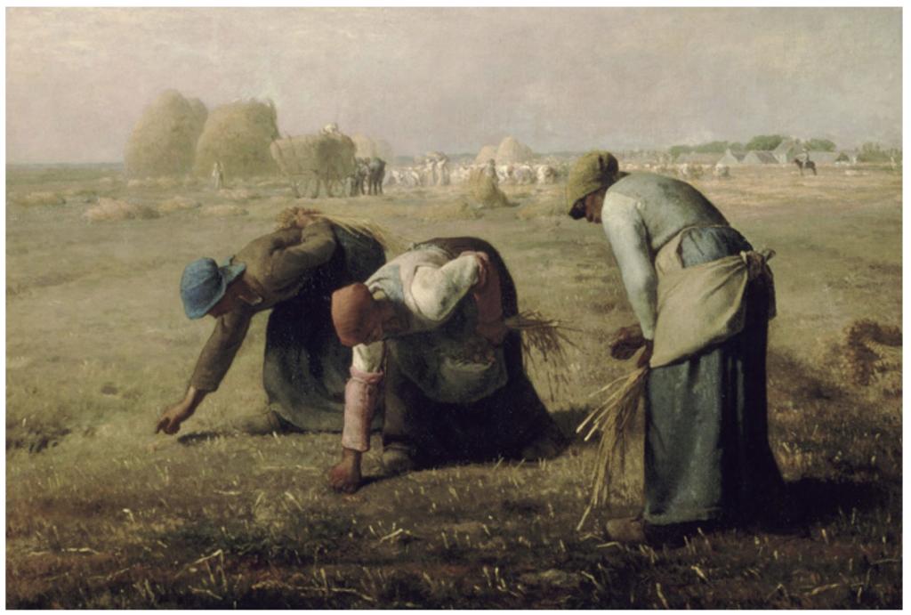
Jean-François Millet, The Gleaners, 1857. Image via Wikimedia Commons.

Arguably the first modern art movement, Realism, began in France in the 1840s. Realism was a result of multiple events: the anti-Romantic movement in Germany, the rise of journalism, and the advent of photography. Each inspired new interest in accurately capturing everyday life. This attention to accuracy is evident in art produced during the movement, which featured detailed, life-like depictions of subject matter.

One of the most influential leaders of the Realist movement is Gustave Courbet, a French artist committed to painting only what he could physically see.

Art Nouveau (1890–1910)

10-art-nouveau-mucha

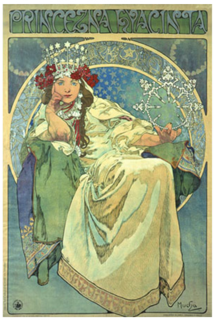
Alphonse Mucha, Princess Hyazinthe, 1911. Image via Wikimedia Commons.

Art Nouveau, which translates to “New Art,” attempted to create an entirely authentic movement free from any imitation of styles that preceded it. This movement heavily influenced applied arts, graphics, and illustration. It focused on the natural world, characterized by long, sinuous lines and curves.

Influential Art Nouveau artists worked in a variety of media, including architecture, graphic and interior design, jewelry-making, and painting. Czechoslovakian graphic designer Alphonse Mucha is best-known for his theatrical posters of French actress Sarah Bernhardt. Spanish architect and sculptor Antoni Gaudi went beyond focusing on lines to create curving, brightly-colored constructions like that of the Basilica de la Sagrada Familia in Barcelona.

Impressionism (1865–1885)

A picture containing building, water, painting, street

Description automatically generated

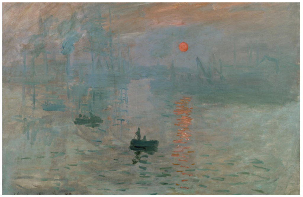
Claude Monet, Impression, Sunrise, 1872. Image via Wikimedia Commons.

Impressionist painters sought to capture the immediate impression of a particular moment. This was characterized by short, quick brushstrokes and an unfinished, sketch-like feel. Impressionist artists used modern life as their subject matter, painting situations like dance halls and sailboat regattas rather than historical and mythological events.

Claude Monet, a French artist who spearheaded the idea of expressing one’s perceptions before nature, is virtually synonymous with the Impressionist movement. His notable works include The Water Lily Pond (1899), Woman with a Parasol (1875), and Impression, Sunrise (1872), from which the name of the movement itself is derived.

Post-Impressionism (1885–1910)

A group of people sitting in the grass

Description automatically generated

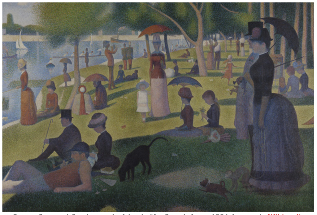
George Seurat, A Sunday on the Island of La Grande Jatte, 1884. Image via Wikimedia Commons.

Post-Impressionist painters worked independently rather than as a group, but each influential Post-Impressionist painter had similar ideals. They concentrated on subjective visions and symbolic, personal meanings rather than observations of the outside world. This was often achieved through abstract forms.

Post-Impressionist painters include Georges Seurat, noted for his pointillism technique that used small, distinct dots to form an image. Vincent van Gogh is also considered a Post-Impressionist painter, searching for personal expression through his art, often through rugged brushstrokes and dark tones.

Fauvism (1900–1935)

A picture containing text

Description automatically generated

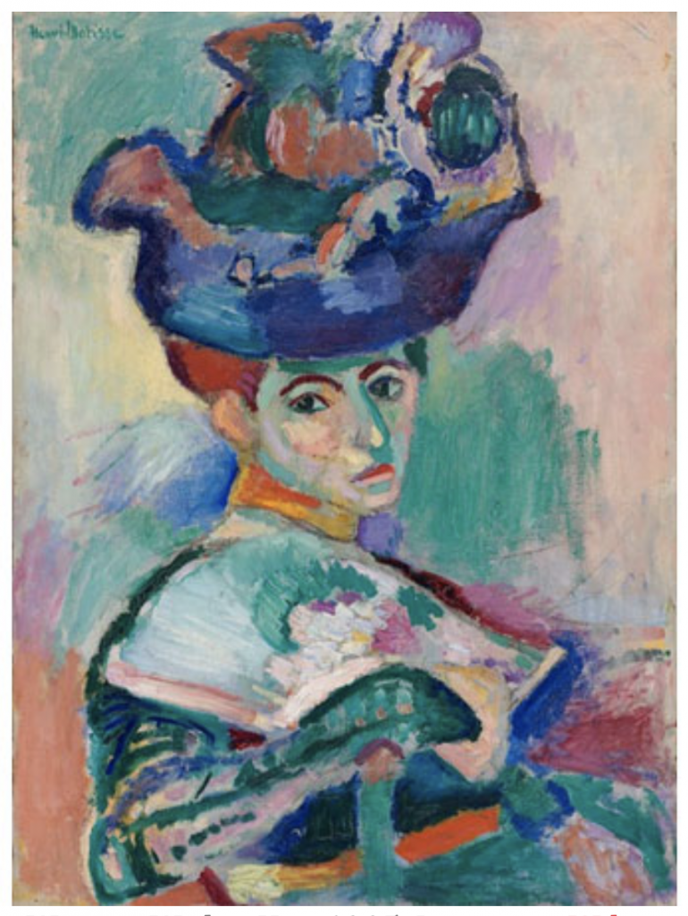
Henri Matisse, Woman With a Hat, 1905. Image via Wikimedia Commons.

Led by Henri Matisse, Fauvism built upon examples from Vincent van Gogh and George Seurat. As the first avant-garde, 20th-century movement, this style was characterized by expressive use of intense color, line, and brushwork, a bold sense of surface design, and flat composition.

As seen in many of the works of Matisse himself, the separation of color from its descriptive, representational purpose was one of the core elements that shaped this movement. Fauvism was an important precursor of Cubism and Expressionism.

Expressionism (1905–1920)

14-expressionism-munch

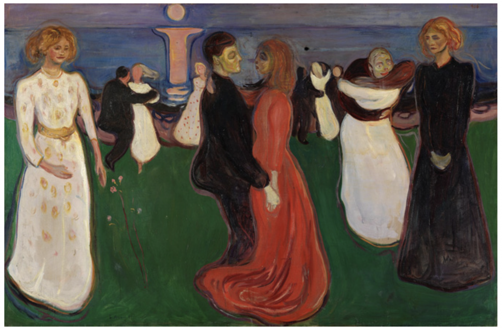
Edvard Munch, The Dance of Life, 1899. Image via Wikimedia Commons.

Expressionism emerged as a response to increasingly conflicted world views and the loss of spirituality. Expressionist art sought to draw from within the artist, using a distortion of form and strong colors to display anxieties and raw emotions. Expressionist painters, in a quest for authenticity, looked for inspiration beyond that of Western art and frequented ethnographic museums to revisit native folk traditions and tribal art.

The roots of Expressionism can be traced to Vincent van Gogh, Edvard Munch, and James Ensor. Prominent groups including Die Brücke (The Bridge) and Der Blaue Reiter (The Blue Rider) formed so artists could publish works and express their ideals collectively.

Cubism (1907–1914)

15-cubism-braque

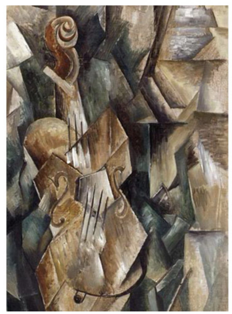
Violin and Palette, Georges Braque, 1909. Image via Wikimedia Commons.

Cubism was established by Pablo Picasso and Georges Braque, who rejected the concept that art should copy nature. They moved away from traditional techniques and perspectives; instead, they created radically fragmented objects through abstraction. Many Cubist painters’ works are marked by flat, two-dimensional surfaces, geometric forms or “cubes” of objects, and multiple vantage points. Often, their subjects weren’t even discernible.

Surrealism (1916–1950)

16-surrealism-magritte

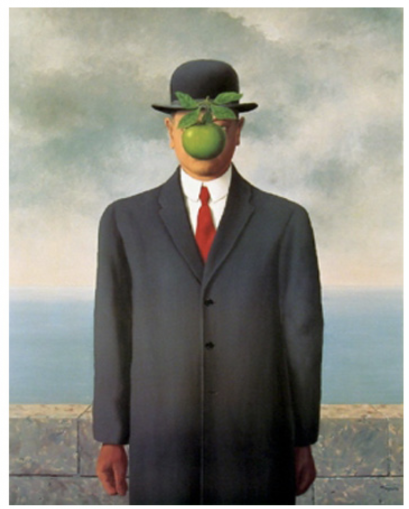
René Magritte, The Son of Man, 1964. Image via Wikipedia.

Surrealism emerged from the Dada art movement in 1916, showcasing works of art that defied reason. Surrealists denounced the rationalist mindset. They blamed this thought process on events like World War I and believed it to repress imaginative thoughts. Surrealists were influenced by Karl Marx and theories developed by Sigmund Freud, who explored psychoanalysis and the power of imagination.

Influential Surrealist artists like Salvador Dalí tapped into the unconscious mind to depict revelations found on the street and in everyday life. Dalí’s paintings in particular pair vivid and bizarre dreams with historical accuracy.

Abstract Expressionism (1940s–1950s)

Shaped by the legacy of Surrealism, Abstract Expressionism emerged in New York after WWII. It’s often referred to as the New York School or action painting. These painters and abstract sculptors broke away from what was considered conventional, and instead used spontaneity and improvisation to create abstract works of art. This included colossally-scaled works whose size could no longer be accommodated by an easel. Instead, canvases would be placed directly upon the floor.

Celebrated Abstract Expressionist painters include Jackson Pollock, known for his unique style of drip painting, and Mark Rothko, whose paintings employed large blocks of color to convey a sense of spirituality.

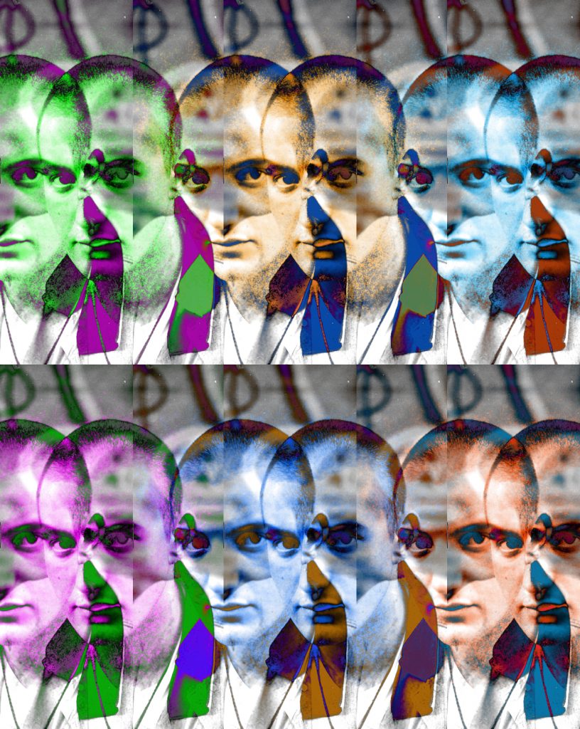
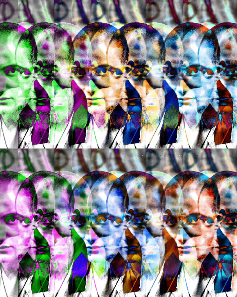
Op Art (1950s–1960s)

Heightened by advances in science and technology as well as an interest in optical effects and illusions, the Op art (short for “optical” art) movement launched with Le Mouvement, a group exhibition at Galerie Denise Rene in 1955. Artists active in this style used shapes, colors, and patterns to create images that appeared to be moving or blurring, often produced in black and white for maximum contrast. These abstract patterns were meant to both confuse and excite the eye.

English artist Bridget Riley is one of the most prominent Op Art practitioners. Her 1964 artwork Blaze features zigzag black and white lines that create the illusion of a circular decent.

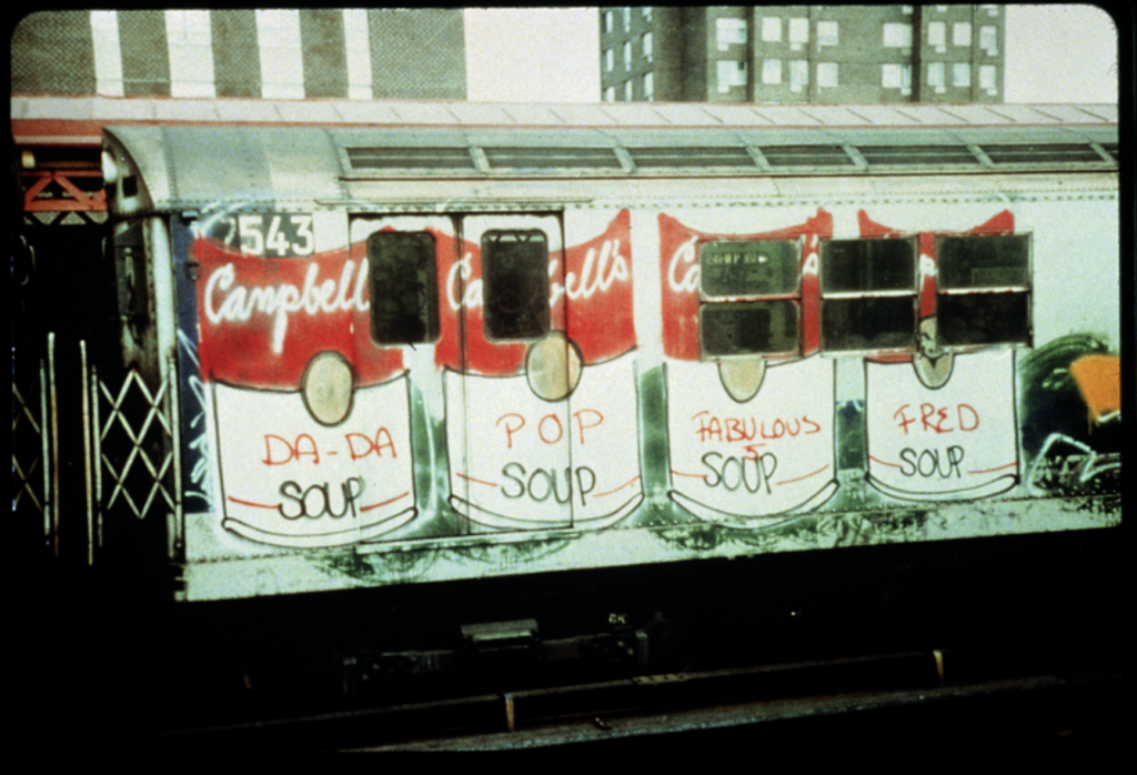
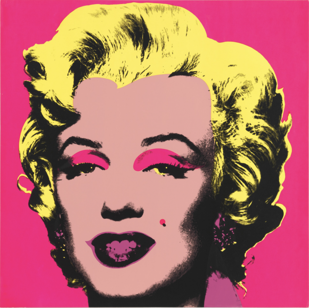
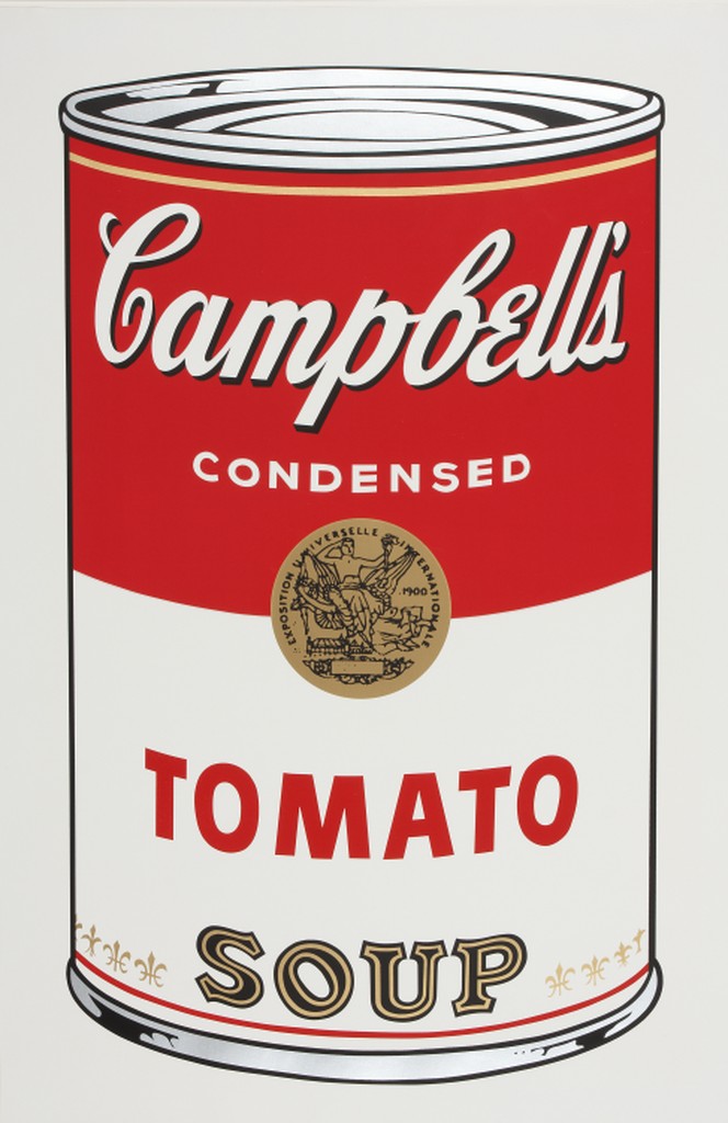
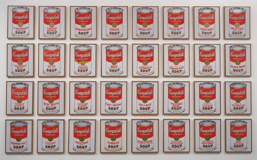
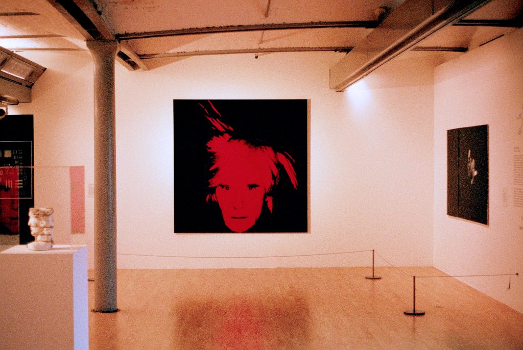
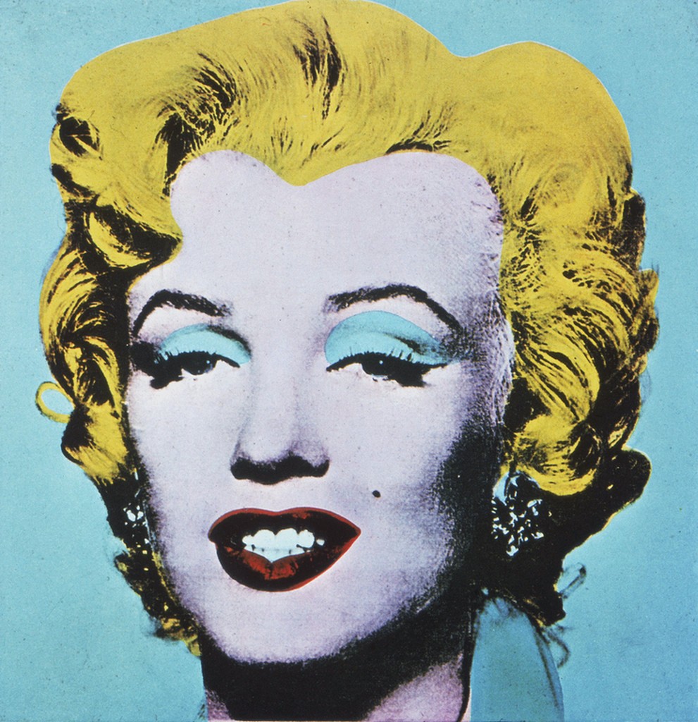
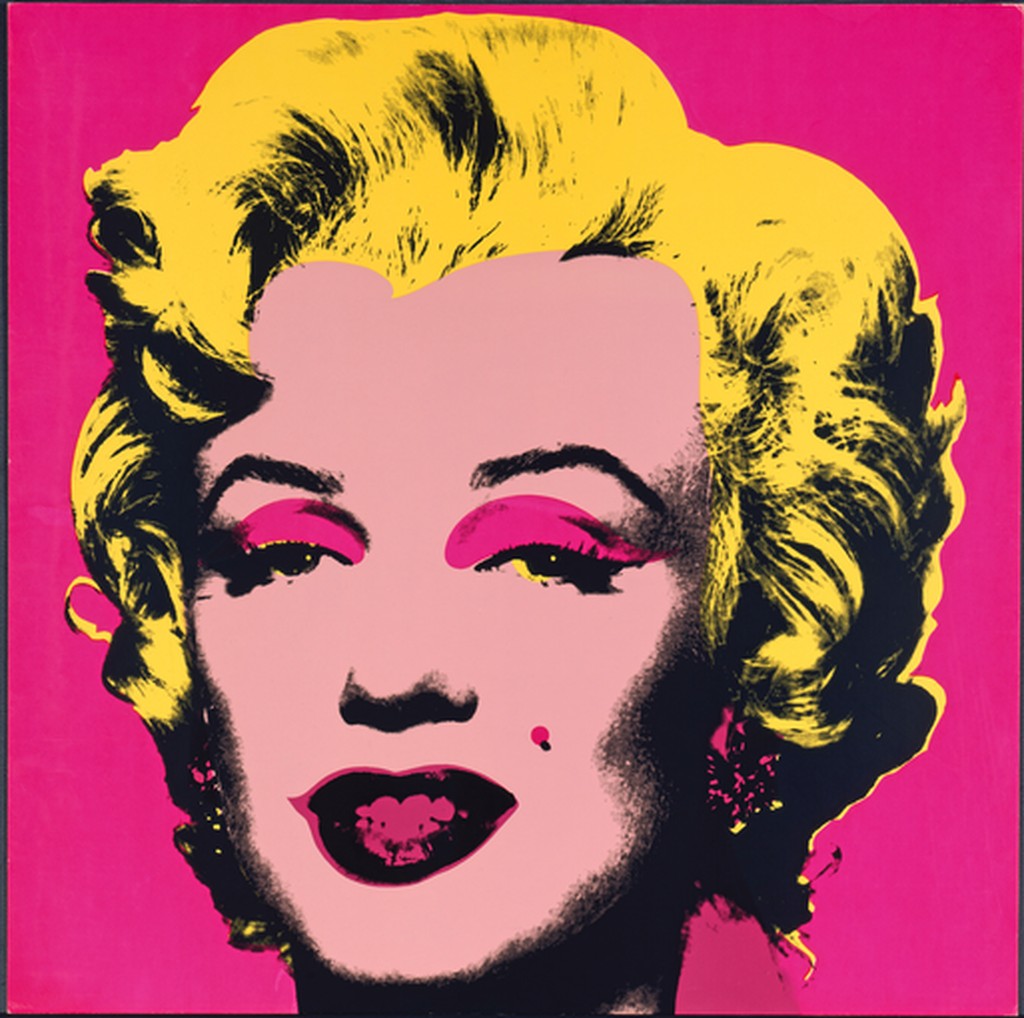
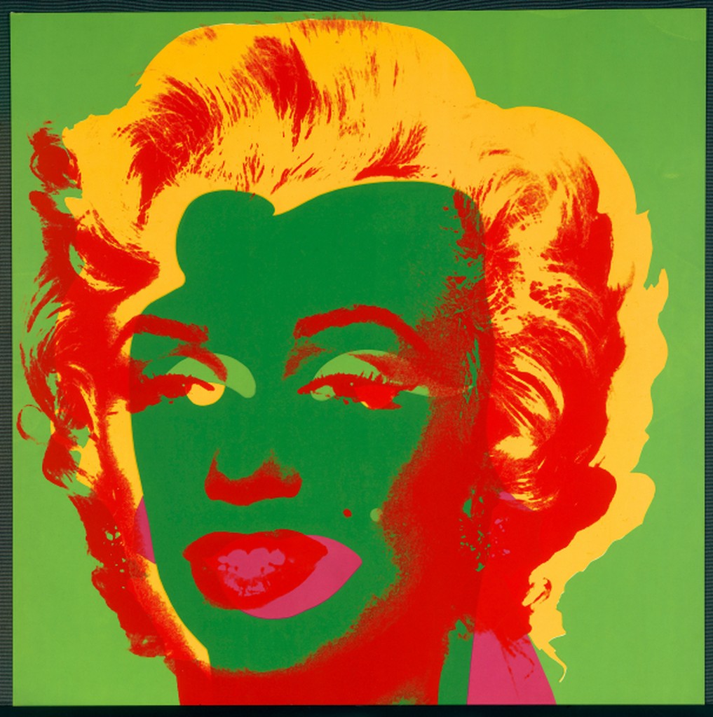
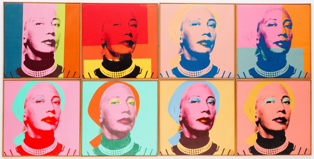
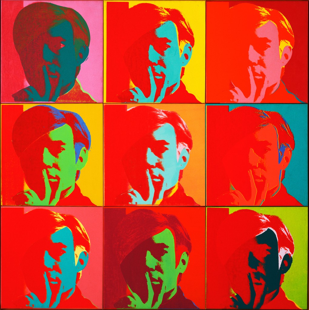
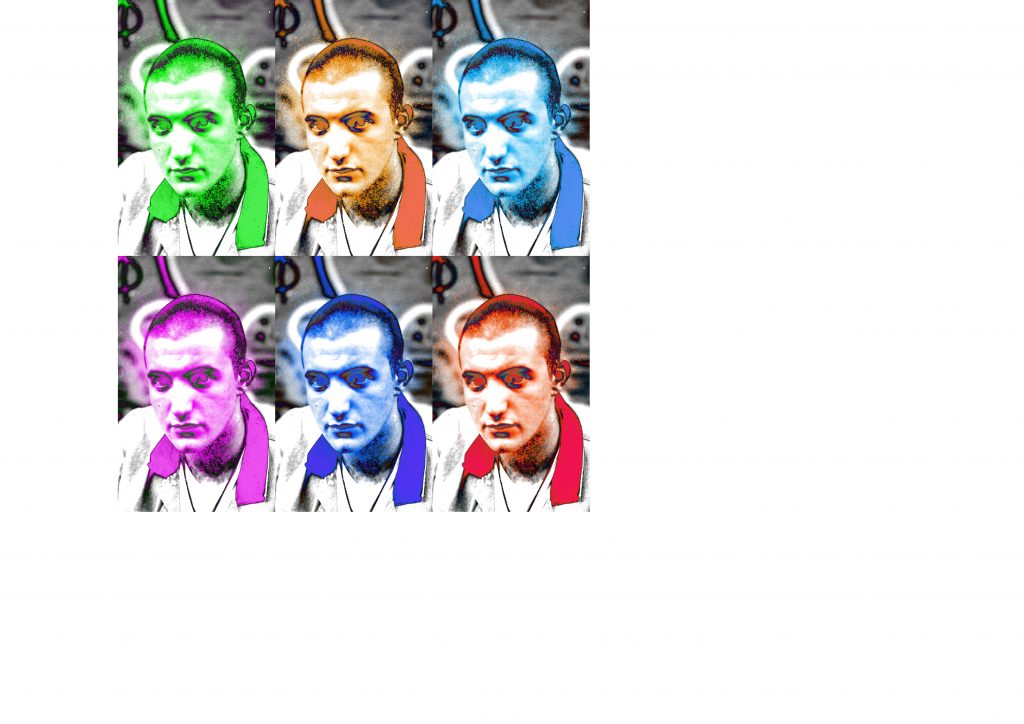
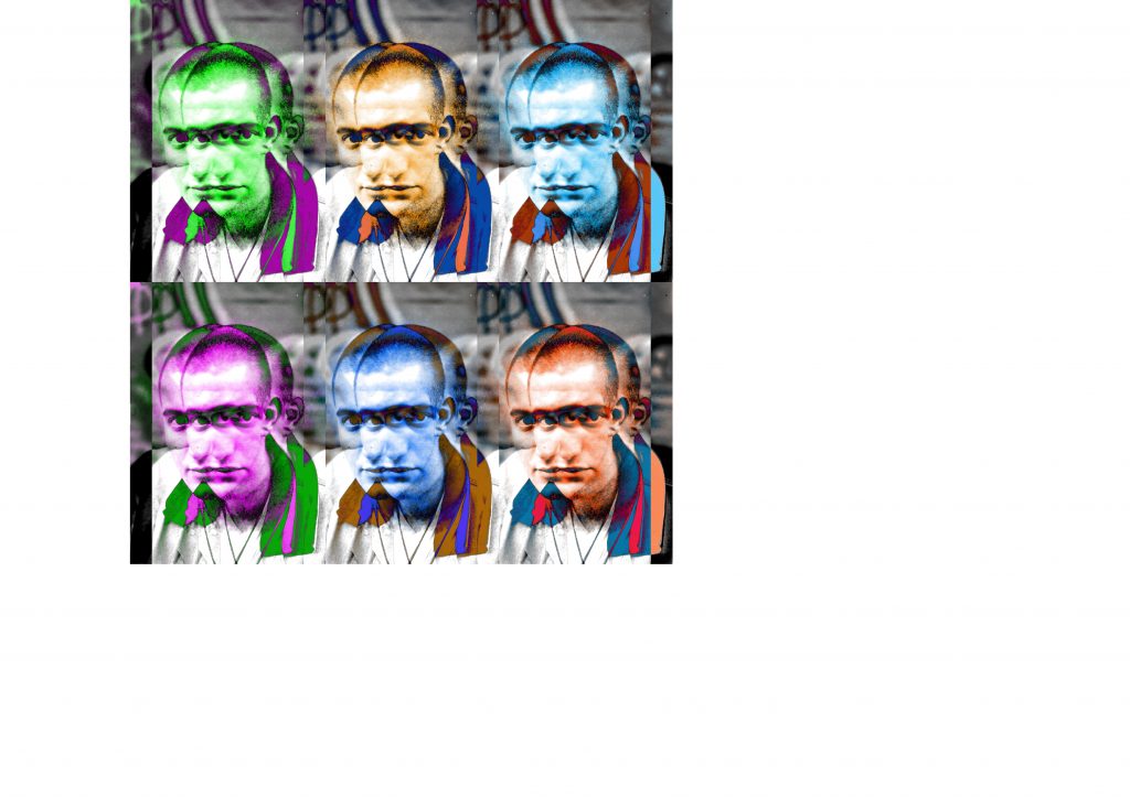
Pop Art (1950s–1960s)

18-pop-art-andy-warhol

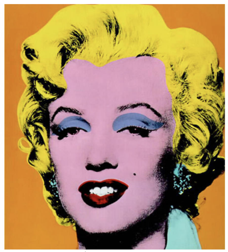
Andy Warhol. Sold for $17,327,500 via Sotheby’s (May 1998).

Pop art is one of the most recognizable artistic developments of the 20th century. The movement transitioned away from methods used in Abstract Expressionism, and instead used everyday, mundane objects to create innovative works of art that challenged consumerism and mass media. This introduction to identifiable imagery was a shift from the direction of modernism.

Pop artists like Andy Warhol and Roy Lichtenstein sought to establish the idea that art can draw from any source and there is no hierarchy of culture to disrupt that. Perhaps the most famous pop culture work of art is Warhol’s Campbell’s Soup Cans production.

Arte Povera (1960s)

Translating literally to “poor art,” Arte Povera challenged modernist, contemporary systems by infusing commonplace materials into creations. Artists used soil, rocks, paper, rope, and other earthen elements to evoke a pre-industrial sentiment. As a result, many of the notable works during this movement are sculptural.

Italian artist Mario Merz, in conjunction with other Italian artists such as Giovanni Anselmo and Alighiero Boetti, created anti-elitist works by drawing upon materials from everyday life. His 1968 Giap’s Igloo, one of what would soon become his signature series of igloos, focused on his occupations with the necessities of life: shelter, warmth, and food.

Minimalism (1960s–1970s)

The Minimalist movement emerged in New York as a group of younger artists began to question the overly expressive works of Abstract Expressionist artists. Minimalist art instead focused on anonymity, calling attention to the materiality of works. Artists urged viewers to focus on precisely what was in front of them, rather than draw parallels to outside realities and emotive thoughts through the use of purified forms, order, simplicity, and harmony.

American artist Frank Stella was of the earliest adopters of Minimalism, producing nonrepresentational paintings, as seen in his Black Paintings completed between 1958 and 1960. Each features a pattern of rectilinear stripes of uniform width printed in metallic black ink.

Conceptual Art (1960s–1970s)

Conceptual art completely rejected previous art movements, and artists prized ideas over visual components, creating art in the from of performances, ephemera, and other forms. Polish performance artist Ewa Partum’s Active Poetry consisted of her scattering single alphabet letters across various landscapes. American artist Joseph Kosuth explored the production and role of language within art, as seen in his 1965, One and Three Chairs. In it, he represents one chair in three different ways to represent different meanings of the same object. Because this type of art focused on ideas and concepts, there was no distinct style or form.

Contemporary Art (1970–present)

The 1970s marked the beginning of contemporary art, which extends through present day. This period is dominated by various schools and smaller movements that emerged.

  • Postmodernism: In reaction against modernism, artists created works that reflected skepticism, irony, and philosophical critiques.
  • Feminist art: This movement arose in an attempt to transform stereotypes and break the model of a male-dominated art history.
  • Neo Expressionism: Artists sought to revive original aspects of Expressionism and create highly textural, expressive, large works.
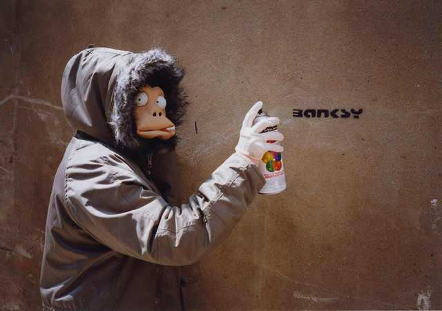
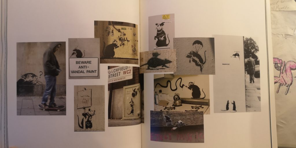
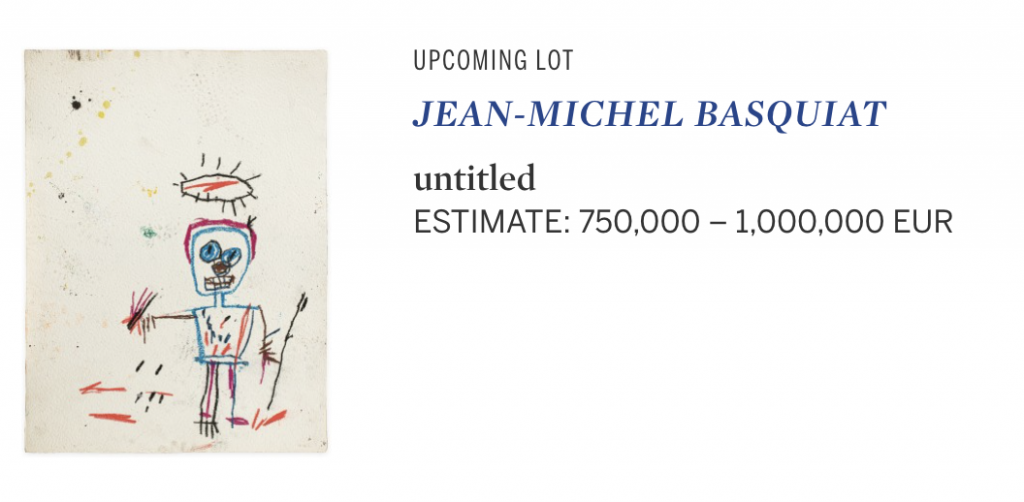
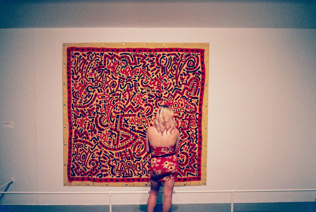
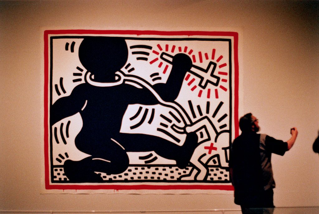
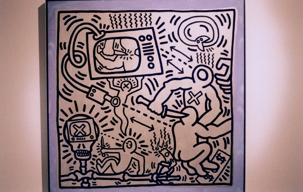
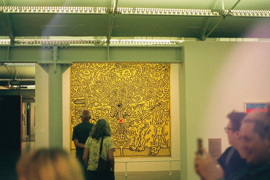
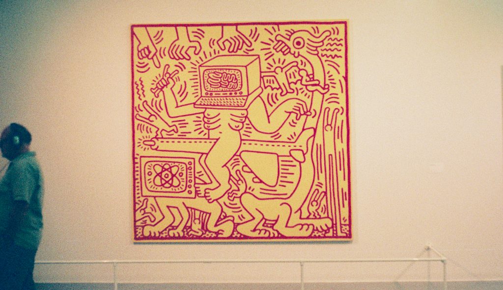
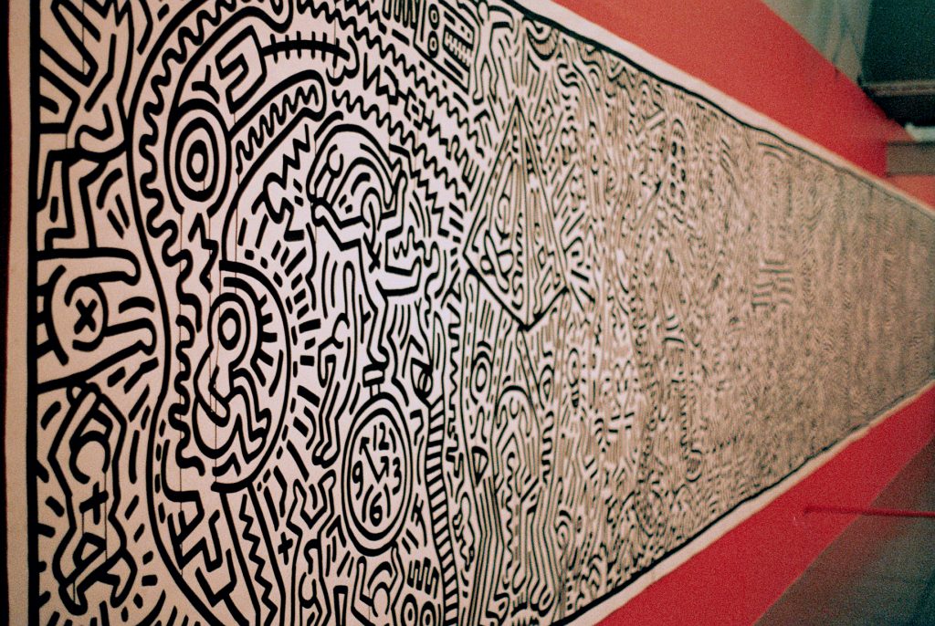
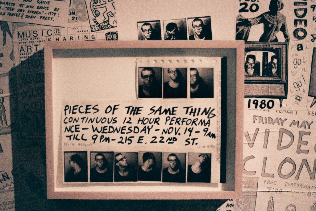
  • Street art: Artists such as Keith Haring, Jean-Michel Basquiat, Barry McGee, Banksy, and more created graffiti-like art on surfaces in public places like sidewalks, buildings, and overpasses.
  • The Pictures Generation: Artists Cindy Sherman, Louise Lawler, Gary Simmons, and others who were influenced by Conceptual and Pop art experimented with recognizable imagery to explore images shaped our perceptions of the world.
  • Appropriation art: This movement focused on the use of images in art with little transformation from their original form.
  • Young British Artists (YBA): This group of London artists were notorious for their willingness to shock audiences through their imagery, and a willingness to push beyond limits of decency. They’re also known for their zestful, entrepreneurial spirit.
  • Digital art: The advent of the camera lent way to this artistic practice that allowed artists to use the infusion of art and technology to create with mediums like computers, audio and visual software, sound, and pixels.

Week 8 Making and Materials

Spray paint

The sword for the artist who paints at knight.

Krylon was the first commercially available spray paint. First introduced in 1947 by Foster & Kester. Krylon spray paint was a go-to type of spray paint for graffiti artist in the 1970s.

Martha Cooper is known for her photography documenting hip hop culture as it developed in the mostly black intercity suburbs of New York. Throughout her images, you can see spray paint. This now adds the association of hip hop culture with the symbol of the spray can. Identity found through an object. It gave a voice to people who most likely would have felt oppressed living in difficult times. Using the humble spray can express in a way a lot of these early graffiti writers where saying, This is me. This is my name this is my art and skill. You can try to oppress me but I will find a way to be heard one way or another.

1981 Beyond words an exhibition for street-based artist to move into a more commercial and fine art based space. Promotional material used imagery of the spray can make the association of street artist use spray paint.

As hip hop culture grew around the world so did the demand for spray paint. The ’90s now saw an increase in specialised graffiti spray paints being created.

Tomato Spray Can Red by Mr. Brainwash | Guy Hepner

Artist like Mr.Brainwash has picked up on the iconic status of the humble spray can using in his artwork to project the same meaning of being an everyday cultural icon as Andy Warhol did with is well-known soup can art piece.

Now Spray paint company Montana now run an ‘artist line’ turning the can into a canvas using the artwork of well known street-based artist. These are now being callable items. The spray can is an iconic image within the street art world as without it street art would not be as much of a big contemporary art movement.

CPS Week 7 Context: Inside of Art

Art in the street

Street art, graffiti, vandalism. Whatever you want to call the art that appears in the streets it’s here to stay. Contemporary graffiti was born as a strong part of hip hop culture in 1970’s new york. Deprived communities creating art against all odds. Graffiti being illegal at the time gave this art movement a raw rebellious feel. This ‘anti-establishment’ context to the art left graffiti being frowned upon, still to this day. Despite that graffiti artist have still found their way into the art establishment. Jean-Michel Basquiat started his art career by painting philosophical thoughts on the streets of new york under the name SAMO©.

The popularity of his works increased until he found himself crossing paths with the likes of Andy Warhol and Keith Haring. Jean Michel was always connected to the art within the streets and the already established fine art world. The art that appeared on the streets helped solidify New York’s creative culture. This art in the streets culture grew much bigger than just New York.

Fab 5 Freddy hip hop pioneer and artist. Painted his own soup cans to illustrate the subway art wasn’t just mindless vandalism but they understood what was happening in the contemporary art space in new york at the time.

Paris 1980s saw its flare-up of art in the streets one of the most notable to be doing street-based art at this time was Blek le Rat he popularized the idea of using a stencil for spray can based art. On a trip to New York City in 1971 he saw his first art graffiti. ‘They were popping up everywhere, on the subway and around the basketball courts. I remember graffiti painted with a marker, like nervous signatures with a crown, allover NY, and big letters filled with spirals and many colours. These miniatures made me so curious’.

Now street art is growing in popularity with more breakthrough graffiti writers such as Banksy. It becomes less of a taboo and more a more widely accepted idea that the street is just another canvas. Subsequently blending the fine art space with contemporary graffiti.

Banksy has been accused of stealing Blek le Rat’s artistic intention or if you want to be hip hop about it, biting his style. Ether way Banksy’s postmodern approach on art now has mass commercial value. Just as Jean-Michel’s artwork is going up in value ever since his death in 1988 at the age of 27.

https://www.sothebys.com/

CPS week 6 Context: Outside of Art

Poverty in the North

S L Lowey was an artist whose work I was brought up looking at. His work was something I never really thought twice about when I was younger. My Nan uses to go to a Saturday morning art class in Salford where he would be painting. I was told as a little boy he was a lovely man but she always thought of his paintings where awful. Which makes me laugh now thinking about it. God rest her soul. That was a lady who had real strength and resilience, like feel most Northerns who have experienced some form of poverty have those qualities.

I feel poverty in the North links to why my grandmother never liked Lowey’s work. It was a depiction on reality she knew. Why bring that into art? why not a beautiful watercolour of nature? or a beautiful portrait like the lady in pearl earrings which I remember looking up at on living room wall by the door. I think for my Grandmother there was no escapism in his art for her so that’s what formed her opinion. The north of England as a history of poverty. A great photographic depiction of this is Don Mullins work. It really illustrates the conditions of these communities.

The way this is going to influence my practice is by embracing the community and background I come from use this within my work. Just as S L Lowey did with his artistic practice.

Week 4 Looking/seeing art: appreciation and analysis

HOW TO ANALYSE AN ART WORK.

An analysis is looking at all of the different components of the art work, considering what they mean, how the artists used them, and/or what the artists intention is and what the viewers response would be. This also requires putting the artwork in context, understanding what ideas or artists influenced the work of art.

Firstly answer the questions up to 6 here,

  1. Formal analysis:

Colour: is it bright, dull, primary, pastel, natural, synthetic?

Form: abstract, geometrical, curvilinear, organic, repeated

Tone: dark, light

Size: massive, tiny, human

Materials: what is it made from, and how does this impact the work?

Shape: is it on a canvas, or cut out on the floor?

Composition: dynamic, straight, narrative

  • How is it installed, is it an installation, a video, is it projected, is it curated?
  • Are there any visual clues, symbols or recognisable objects in the work?
  • Can you decipher any meaning? What is it trying to say?
  • What type of work is it, is it a painting, mixed media, a sculpture, video, photograph etc.
  • From looking at the work does the work fit into a period of art, or part of a wider group of artists?
  • What other works of art influenced the artwork, what does it look similar too?

Use the internet to help answer the following questions

  • What is the context for the work of art, is it inspired by history, politics, changes to art in society, the use of new materials, a development of a new technique of art.
  • Did anyone important write about the work, or did the artist write about the work, find interviews or articles.
  • Was the artwork in any important shows?
  • What period of time and history is the work from?

Analyse an Artwork

Artist: Title:        Date
Colour:    Form:          Tone:
Materials:    Shape:          Composition:
Installation:  Symbols:            Medium:
Does it look like any other art you know?      Is it from a group or period of art?            What is it trying to say?
Context:Writing (links)            Shows:
Personal response:            

Andy Warhol Untitled from Marilyn Monroe 1967

Bright vibrant bold colours yellow and pink shades used block format to create contrast. Layered on top this colour pallet is a jet black tone which creates the iconic pop art look. The form is a truthful depiction of the subject which contrasts with the abstract use of colour. Created using screen-print on canvas. Drawings were reproduced and then hand coloured.

The piece is 91.5 x 91.5 cm and was published at Factory additions New York. Printed at Aetna Silkscreen products, Inc, New York. The work hands in the Museum of Modern Art. Andy Warhol was at the pinnacle of the art world in the 60s this piece was created in 1967. Pop art style changed the narrative of the art world and in the early ’60s. Andy Warhol received a lot of criticism for his work before he became an art icon within himself. Warhol’s artwork was so heavily based on popular American culture and icons. Marilyn Monroe was highly sought after actress at the time of this piece was created. The composition focuses in on just the head cutting any other context out of the picture. My personal response to why Warhol made this creative decision is he was making a comment on the idea of her being an icon and the way the focus was so intensely focused on her. The colours used in my opinion have been used to further this idea of focus on her as its so jolting to the human eye can’t help but look at the piece. It’s unavoidable. This emulates the way Marilyn Monroe was unavoidable in American culture around the time this piece was originally created. Andy Warhol changed art not only American culture but western culture. His art and the pop art movement became American culture and Andy Warhol himself became an icon in his own right because of that.   

Week 3: Tate Liverpool

Tate Liverpool is the only Tate in the North of England. Set in the historic Royal Albert docks. Swiss-artist Ugo Rondinone’s has a 10-meter high sculpture within Mermaid Courtyard, outside Tate Liverpool. You know you’re in the right place when you see this.

The building the Tate is situated in still has a lot of the original integrity of the building itself, steel beams on show, red brick and stone floor which flows from outside the docks in. Throughout the three floors of the gallery space, there are beautiful large what looks like original windows which not only face outwards onto the dock but also across over the river Mersey. Of course, Tate Liverpool also has its own gift shop and cafe wouldn’t be a real gallery without them in my humble opinion.

Keith Haring Exhibition

I went to the Tate Liverpool times in 2019. What a beautiful time that was not having to walk around a one-way labyrinth to go back to see the same piece twice. The luxury! when there I saw the Keith Haring exhibition. Curated by Darren Pih.

What I really loved about this exhibition was how it really gave Keith’s larger works space to breath. Leaving the scale of the work to make a real impact on the viewer the moment you walked into the exhibition.

Something I really enjoyed about the creative direction of the exhibition was the use of the title cards which just said ‘untitled piece’ which I feel really inspires thought about the art piece in front of you and what the deeper themes of the works are.

What I find really powerful about Keith Haring work is the ability to convey such deep thought-provoking messages through such simple but bold means. Using mostly painted thick, bold lines and a limited colour pallet. In-person this graphic style for me is incredibly impressive as its too easy to disregard the skill and thought that goes into these works. I also think you can tell though the work Keith enjoyed expressing himself in such a bold visually rich way.

The way this piece was placed I found was very thought out as it pulls you round the corner by your interest. As you can see in my image viewers being pulled in by one of his other works, only to see the white wall coming to a sudden stop. This piece which as such a piercing face drawn in the centre makes you want to gravitate around the corner to look closer at the detail as there is so much being expressed though the mostly black line.

The red wall really grabs your attention at this point of the exhibition but before you can even realise this someone subconscious effect the curators played on you’re already astonished by the scale of this work and feel of how this piece could keep going on, which is something I’ve tried to convey in my photography of this piece. There’s so much going on it all started to blur into one and don’t know where to start to detect it. Having said that the more you observe this piece you’re able to home in on these small details which almost act as subplots to the bigger story being told through Keiths visual language this builds up to create an incredible scaled artwork.

I personally enjoyed the way photography and video had been included in this exhibition. I think this really showed Kieth creative mind and how it wanted to play around with ideas and new concepts, especially within his wordplay. What I find interesting and clever is the way Keith put himself centre within these images and videos. As Warhol did, around this time as well. I personally think it’s a great way to market themselves as Artists putting themselves within and at the forefront of the work. A smart way to become known within this art world and popular culture at the time.

Especially in the art climate in the 1980’s New York. I think Kieth’s style and work are clearly influenced by the fast pace atmosphere found in New York with the speed he would create his works in. The over-saturation of advertisement and fighting for his work to be viewed is something he did from the beginning jumping on the New York subways and claiming space for his art before another advertisement did. Kieth had the audacity to do this and share his work with the world to create a name for himself. This is what he did and this is why the art world will not be forgetting his impact anytime soon.

Painting

Year 1 Fine Art.  F1030

Painting Module.   15C

My Project

Create a body of research that will develop into a series paintings. One of these should be done on the prepared canvas to be made during the wood workshop sessions in weeks  4 and 5

Your research should be generated from the theme of –

Structure – Space – Time

You must work from observation in the first instance and allow the work to develop. Below are prompts and examples for each theme;

Time:  decay/renewal, movement, crowd, still, individual, journey, something happening, change of light, travelling, change of position, conservation, scanning, day / night, over a period of time, driving, changing narrative, family, skin/surface, opinions and ideas, old and new, process..

Space: Microscopic, urban, personal/private, close up, decommissioned, vertiginous, crowded, outside, infinite, domestic, obsolete, retail, geographic, decomposing, demographic, wide angle, claustrophobic, expansive, internal, macro, specific space or environment..

Structure: routine, architecture, traffic, motif to represent self, 24 hrs, portrait, journey, route, retail park, data interpretation, catalogue, process, habit, organisation, possession/s, gathering, collection/s, museum, curation, life style, ordering..

The above lists will hopefully help you to think about your approach – they are just prompts – what is important is your visual interpretation of a subject that interests you, your ability to sustain it over 11 weeks and your ability to understand your artwork in a contemporary and / or historical context.  Evidence of your project underway needs to be available at all the taught contact sessions over the next few weeks (because we will want to see it). So its important to get it underway, from week 1

A group crit will be held during weeks 7,8,9(provisionally).  Be prepared to say how you approached this project and what decisions you made. Your work should consist of drawings, small colour studies, collages, notes and information regarding other relevant artists and their work.

The work should be inventive and visually interesting and should show your enthusiasm for the area in which you decide to work.

Composition, light, colour and paint application as explored in the first few taught sessions should continue to be considered. Refer to the small paintings in the workshops to help inform your decisions & approach.

please make sure you have a record of the:

3 x the small boards from week 1  the primary colour/mark & surface painting

4 x white paintings from week 2/3

Your large paintings from weeks 4&5

Research into at least 3 artists suggested for these weeks

Learning Activities

This module provides a sound knowledge of procedures for researching, constructing and developing paintings. There is a particular reference to colour, composition, paint application and various traditional and contemporary methods of making paintings. The teaching will consist initially of short ‘workshops’ followed by theme or subject-led projects. It will offer practical experience and develop a growing awareness of the criteria for critical evaluation of results.

There will be a short course in the Wood Workshop that will enable you to prepare canvas and board ready for painting. Induction through WORK 1000 is a prerequisite for this course.

Throughout the teaching there will be considerable opportunity for individual interpretations of themes and subjects and students will be introduced to the working practices of other artists to illustrate and develop critical understanding. The main

purpose of the module is to extend your experience of Painting and to develop critical awareness in evaluating work done. It is intended to encourage the recognition of and confidence in the development of individual ideas and work processes.

First ideas

I want to look into the times we are in and how that’s changing the structures of how we live and the spaces around us.

A new Icon?

Within this series of images shot in a repetitive structured way to play with the idea of repetition. Exploring the times we are living in and how our surroundings have changed day-to-day in these easily forgotten spaces. Now becoming the ‘new normal’. In less than a year I feel the mask has become a new global icon. Though a crazy amount of repetition. The vast majority now knows what a square rectangle with two curves now means, Mask.

An Art Icon

Most people in western culture knows arguably associates this can with art now. Regardless of how much or how little is known about this piece. Andy Warhol the artist behind the piece played around with the idea of repetition. Creating artwork from objects within his time. I personally enjoy the uniform structure of his this art piece being so many of the same with only slight variation withing the text used. Over time as he focused on iconic images he himself became an ‘icon’ blending the structure on where an artist starts and art beings.


Notes made after watching the film.
Disconnected character
Repetition 
Colours used not a natural palette. secondary colours mostly 
Factory 
Controlling character
Alien-like persona 
Loved the imperfections within his art 
Used people as objects in his video work like how other artist use brushes to canvas 
I don’t think he always knew what he was doing he just did
Self-portrait
He became a part of the art 
The art and life blend together 
He created a creative community 
60’s 70’s
Almost killed by actress
Had rises stars around him in ‘the factory’
Screen tests shot actresses still as if he was filming a still object
Used video more than I thought he did 
Moved to more conventional work in the ’70s
Was hated by the older art world in the early ’60s 
Arguably over-hyped in the art world and a false Icon now 
Only human with flaws like any other human

I love the way over time the colours used in my opinion evolve a new take on the same image and pushes away from the original structure used.

Reputation and bold colours. A total contrast to the artwork created earlier in the century by which typically had much more natural structures and colour tones used.

Painting workshop

I really enjoyed this workshop. Really helped me to think about painting differently and that you can be a lot freer when creating not only have to stick to a sort of set preset structure within my head.

I wanted to play around with self-portraiture colours, negative colours structure and now this can change over time.

Because people are not used to seeing advertisements or propaganda for which the product or motive is not obvious, frequent and novel encounters with the sticker provoke thought and possible frustration, nevertheless revitalizing the viewer’s perception and attention to detail. The sticker has no meaning but exists only to cause people to react, to contemplate and search for meaning in the sticker. Because OBEY has no actual meaning, the various reactions and interpretations of those who view it reflect their personality and the nature of their sensibilities. Many people who are familiar with the sticker find the image itself amusing, recognizing it as nonsensical, and are able to derive straightforward visual pleasure without burdening themselves with an explanation. The PARANOID OR CONSERVATIVE VIEWER however may be confused by the sticker’s persistent presence and condemn it as an underground cult with subversive intentions. Many stickers have been peeled down by people who were annoyed by them, considering them an eyesore and an act of petty vandalism, which is ironic considering the number of commercial graphic images everyone in American society is assaulted with daily.

‘Speak out, condemn oppression, save humanity’
Whitewashed
Manchester 2020

I feel this says a lot about the times we are living in.

‘Please keep your flesh distanced, but spirits close :)’
‘Just because our flesh has to be socially distanced doesn’t mean our spirits have to be distant’

caveman aches graffiti wording where art is going time whitewash