Brandalism

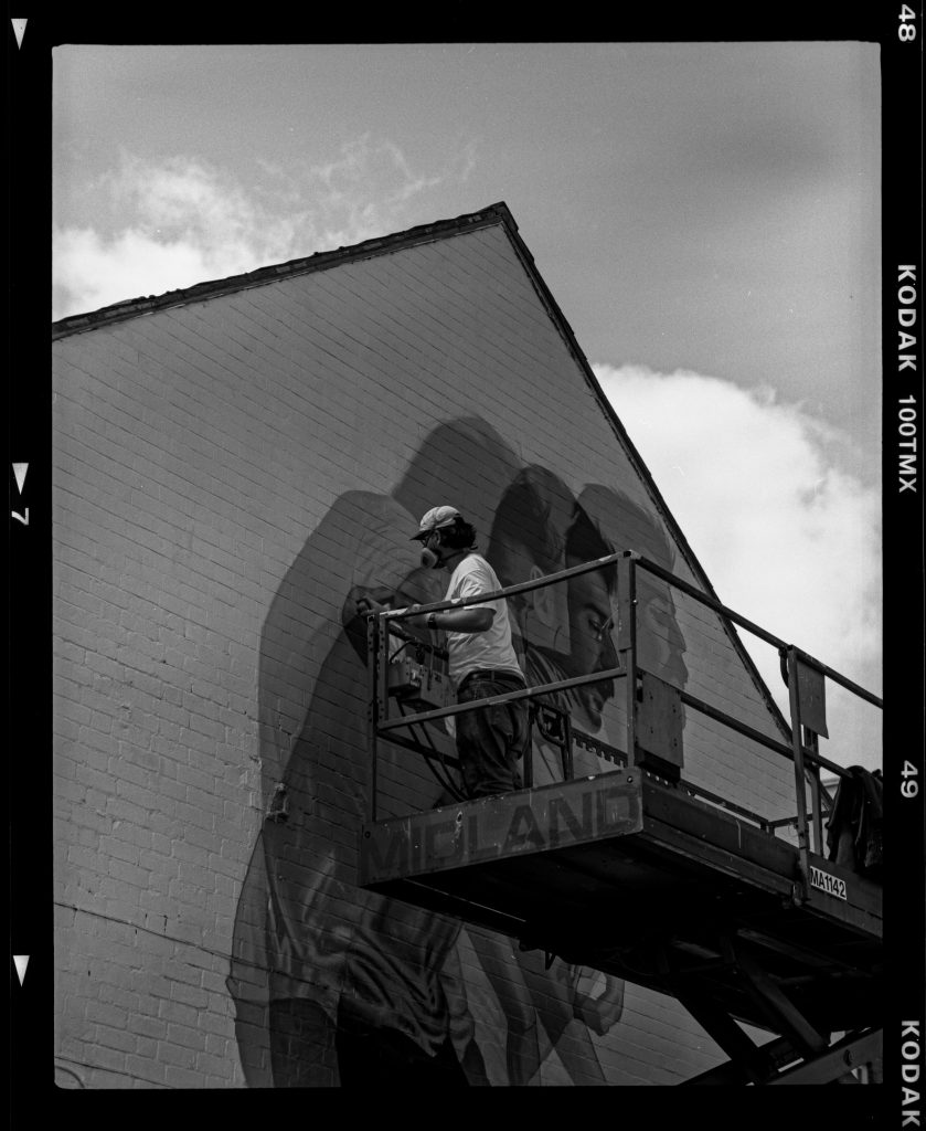
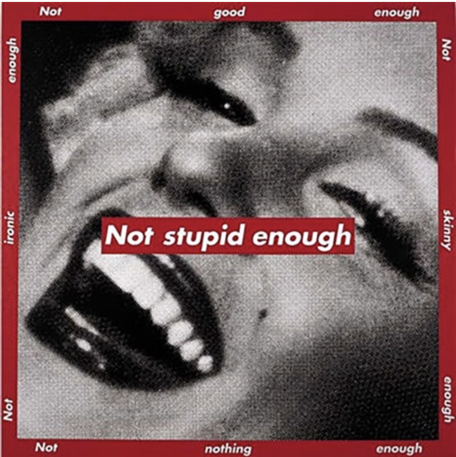
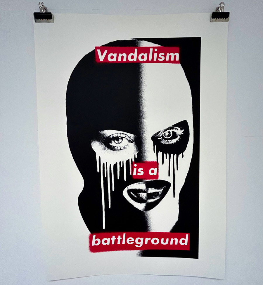
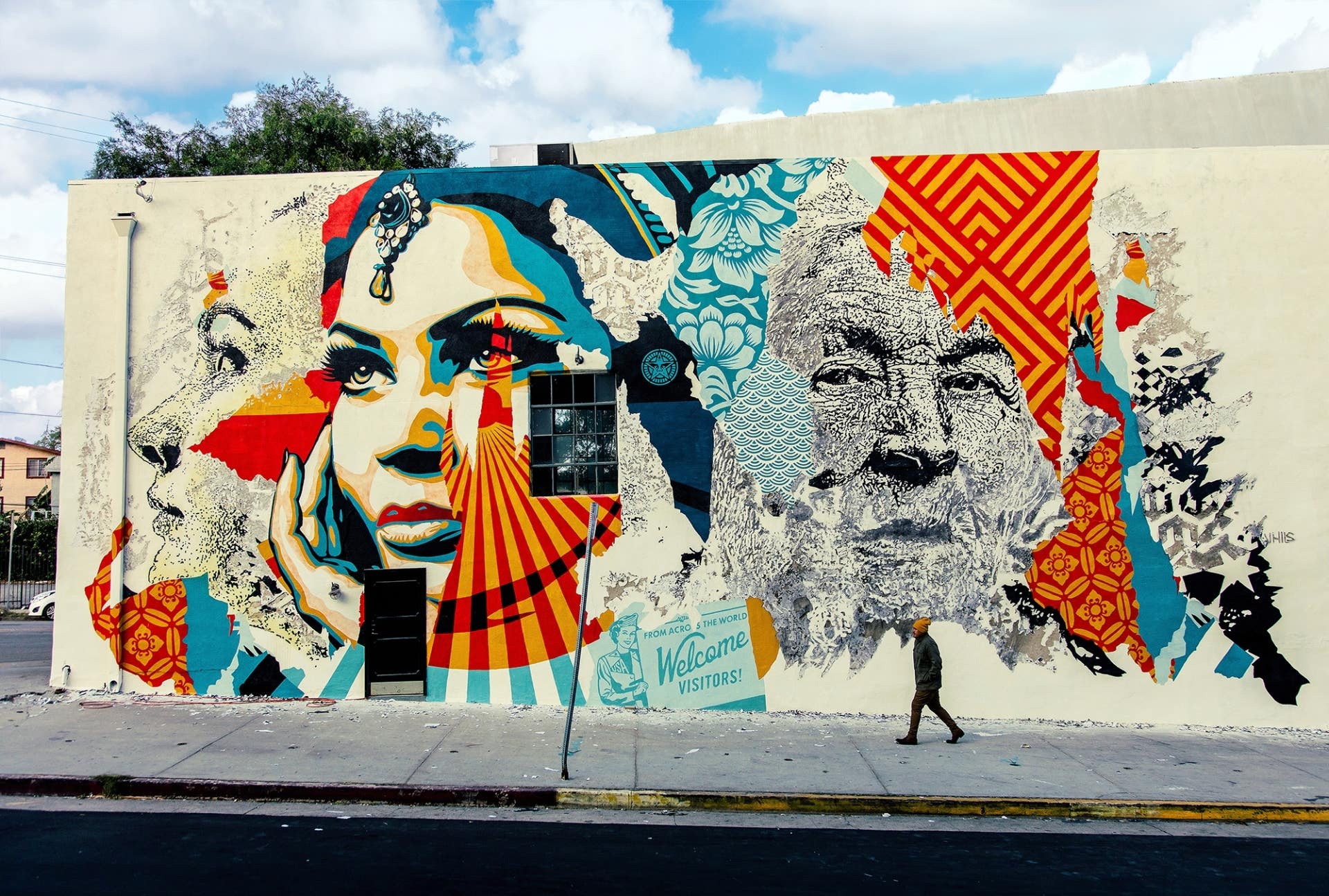
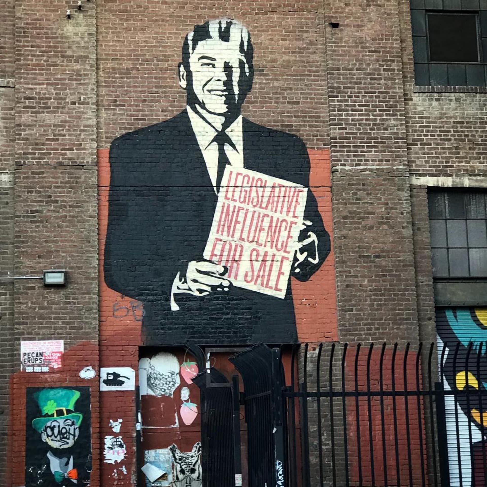
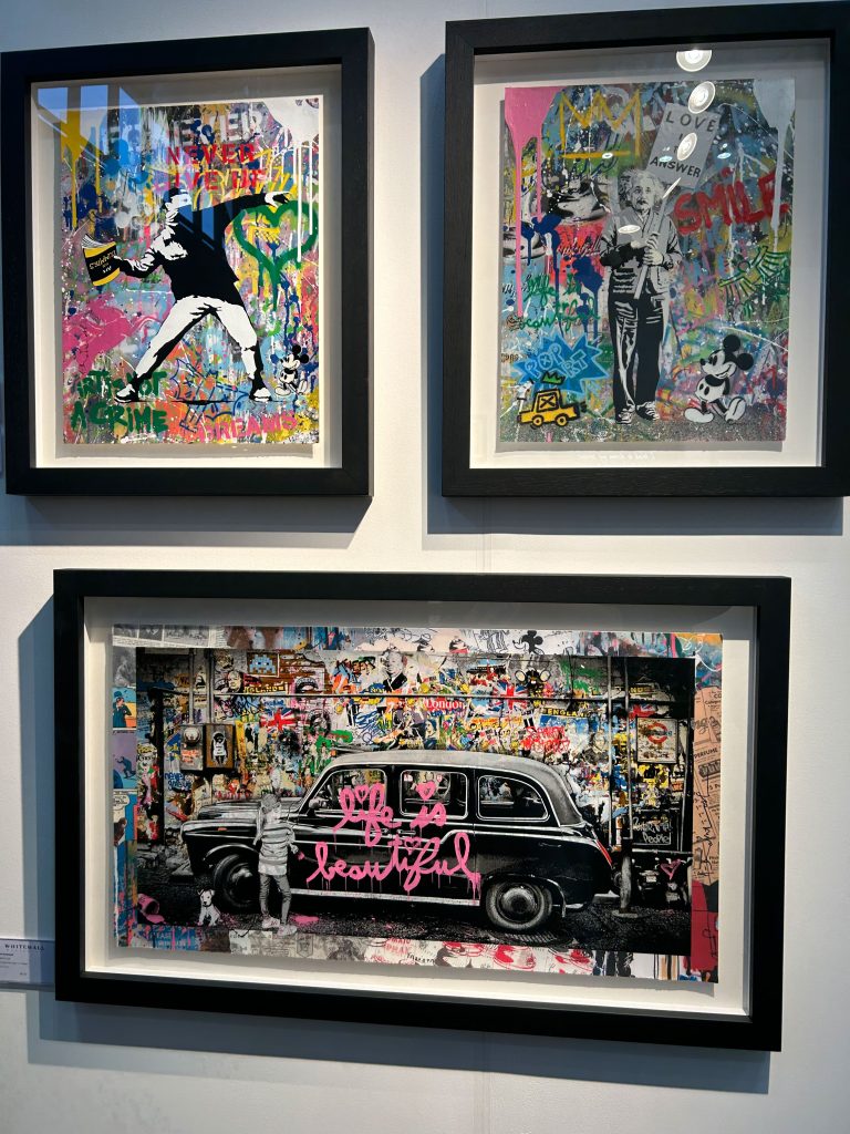
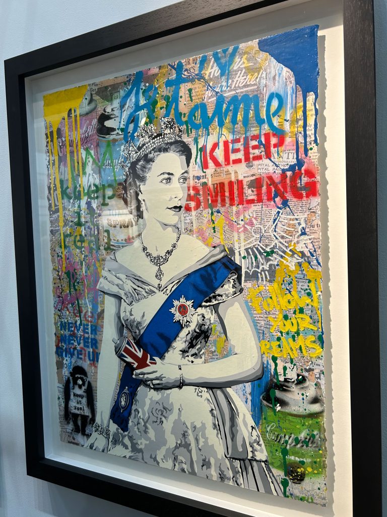
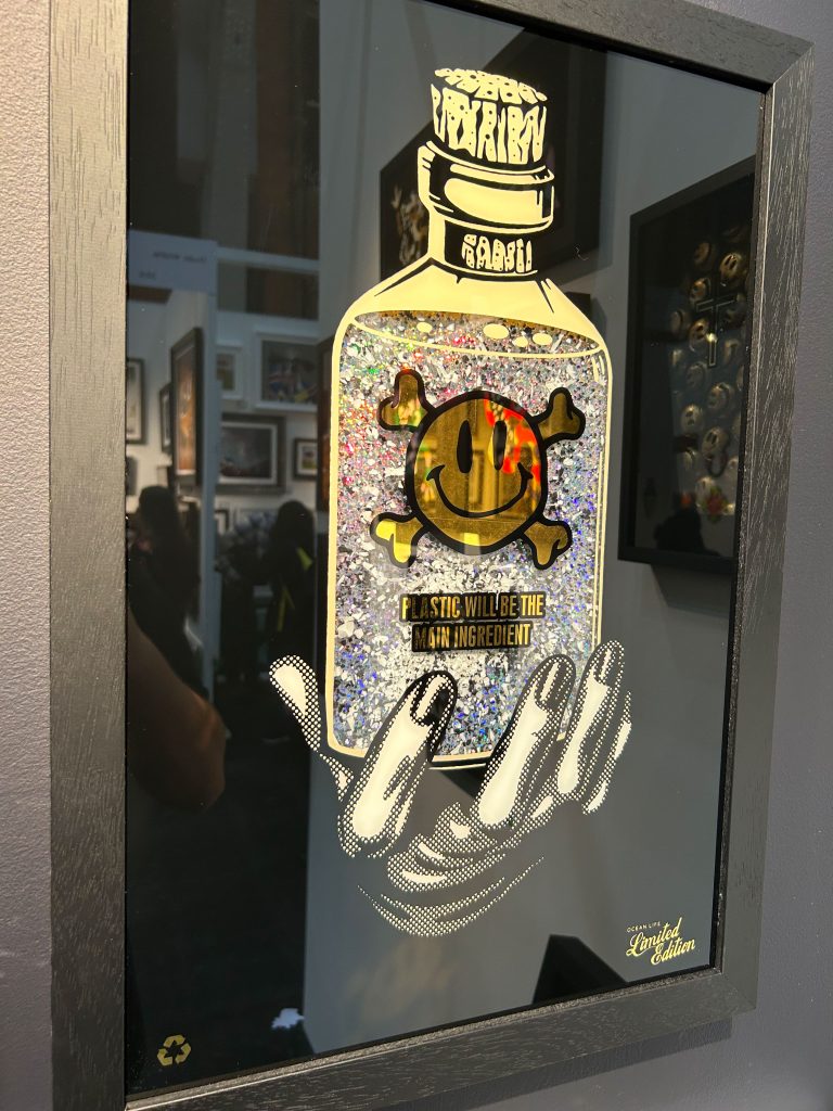
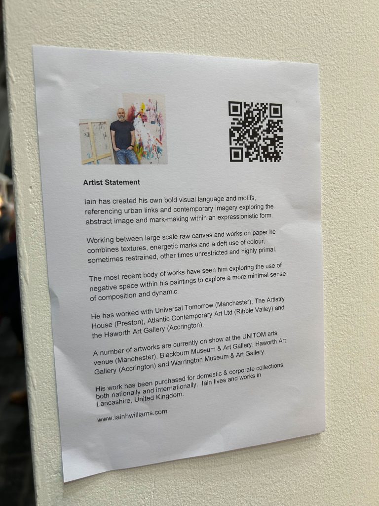
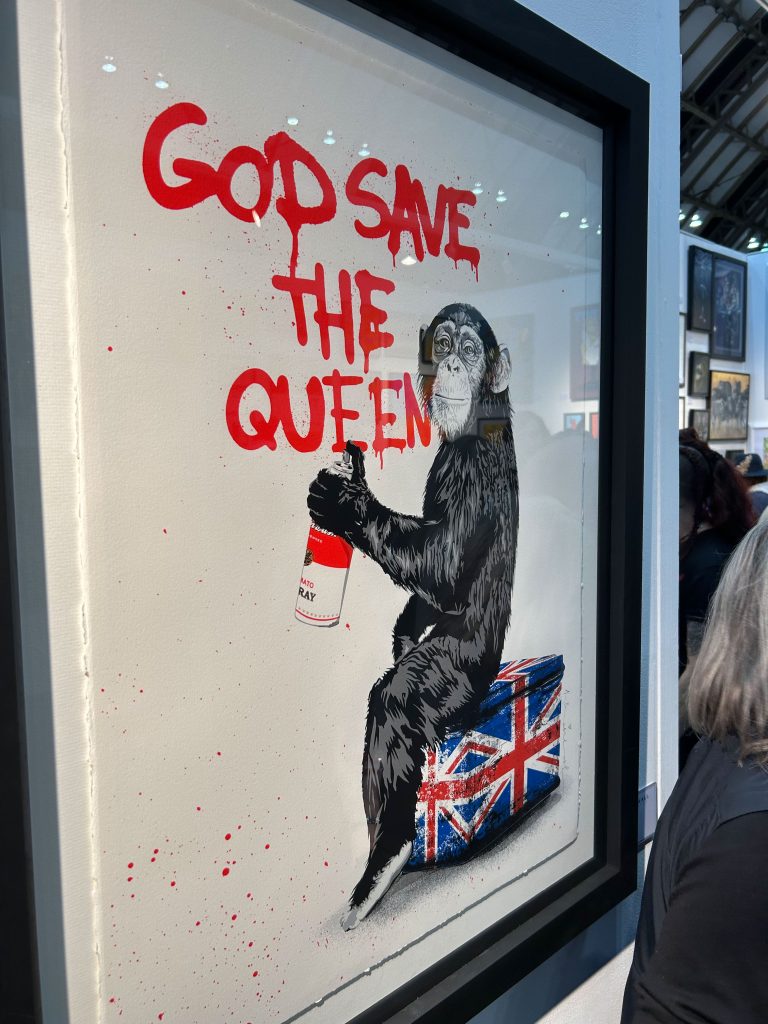
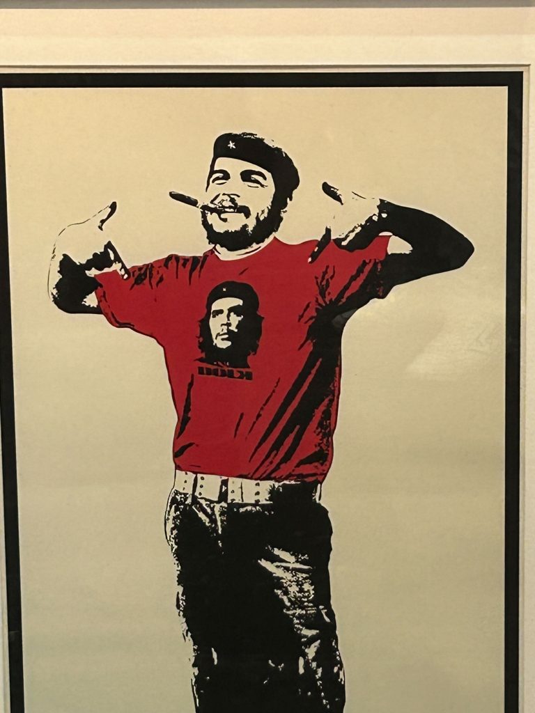
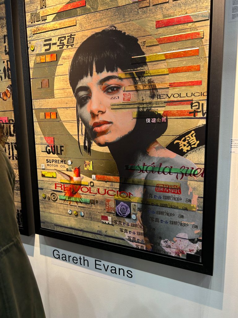
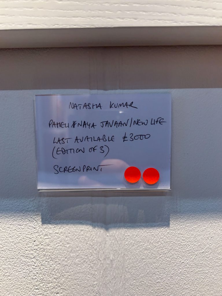
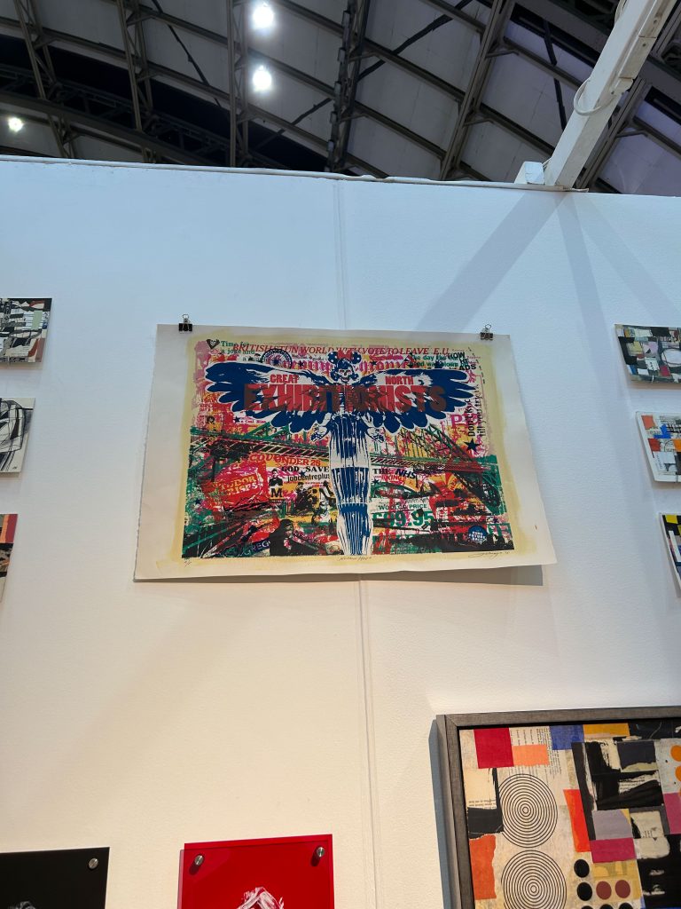
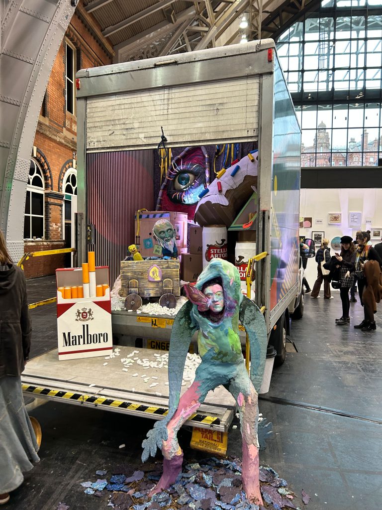
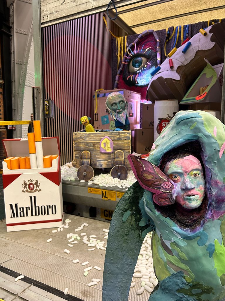
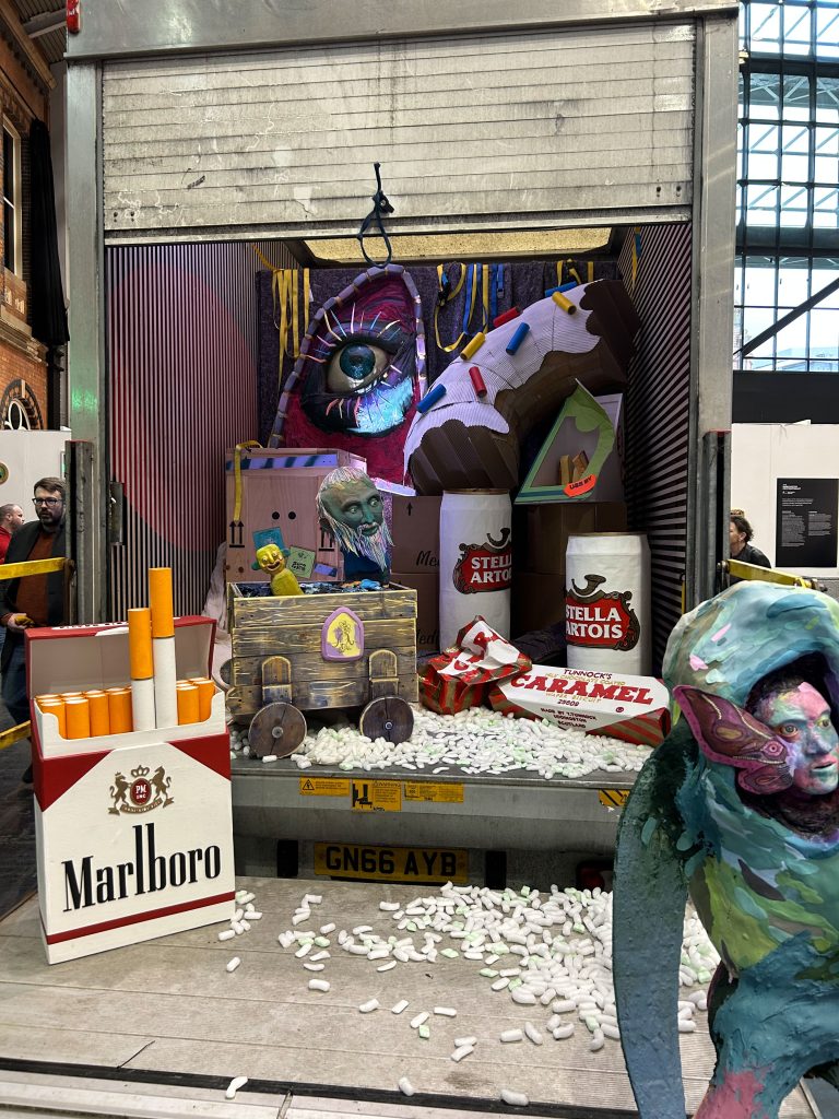
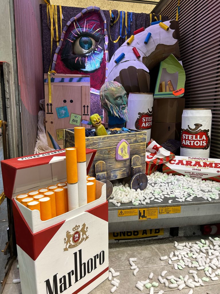
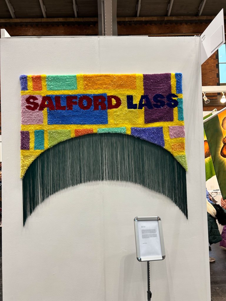
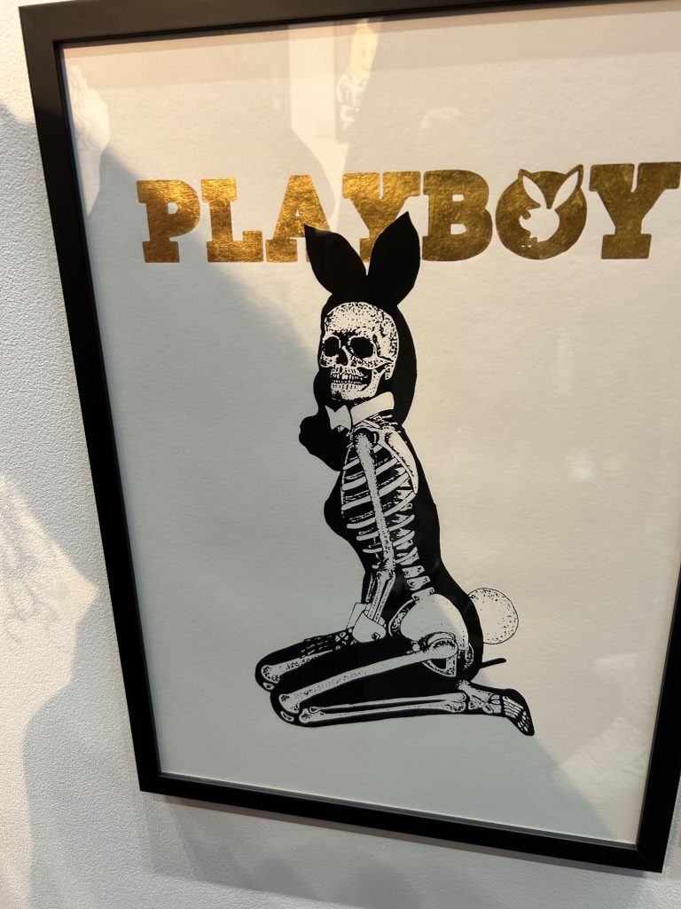
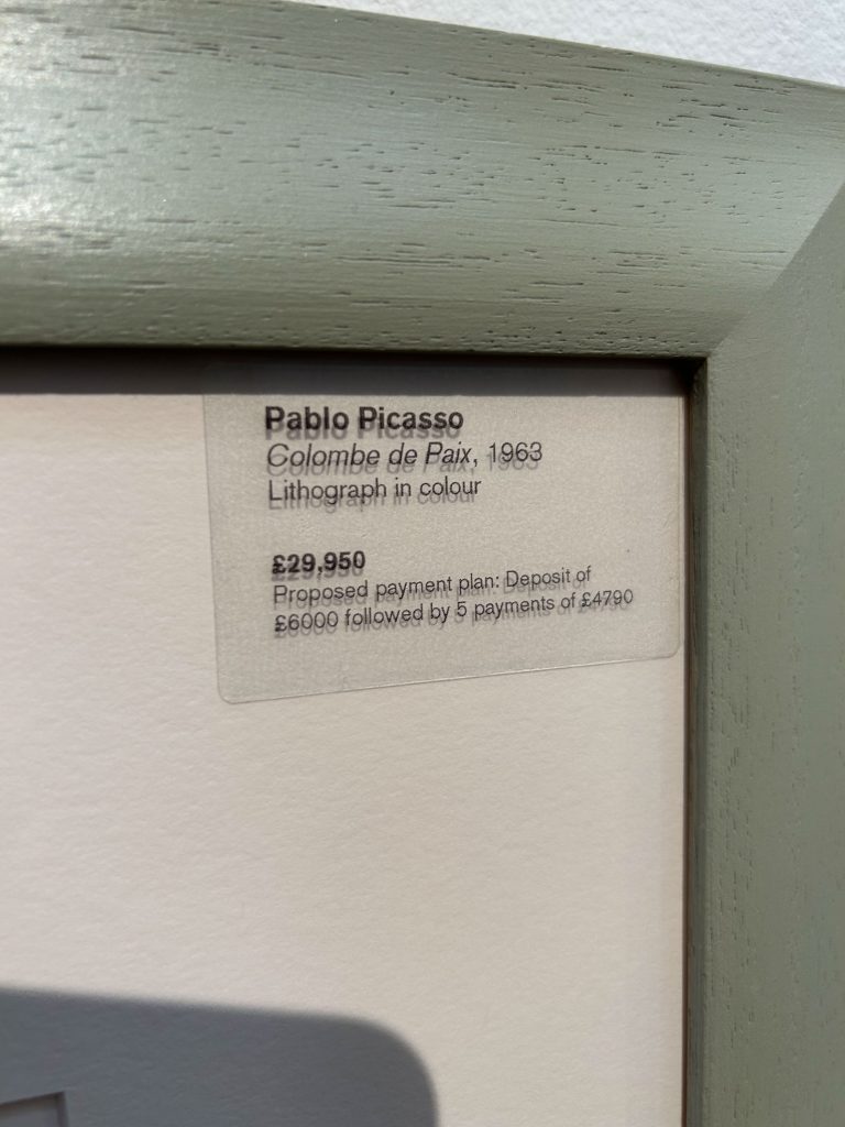
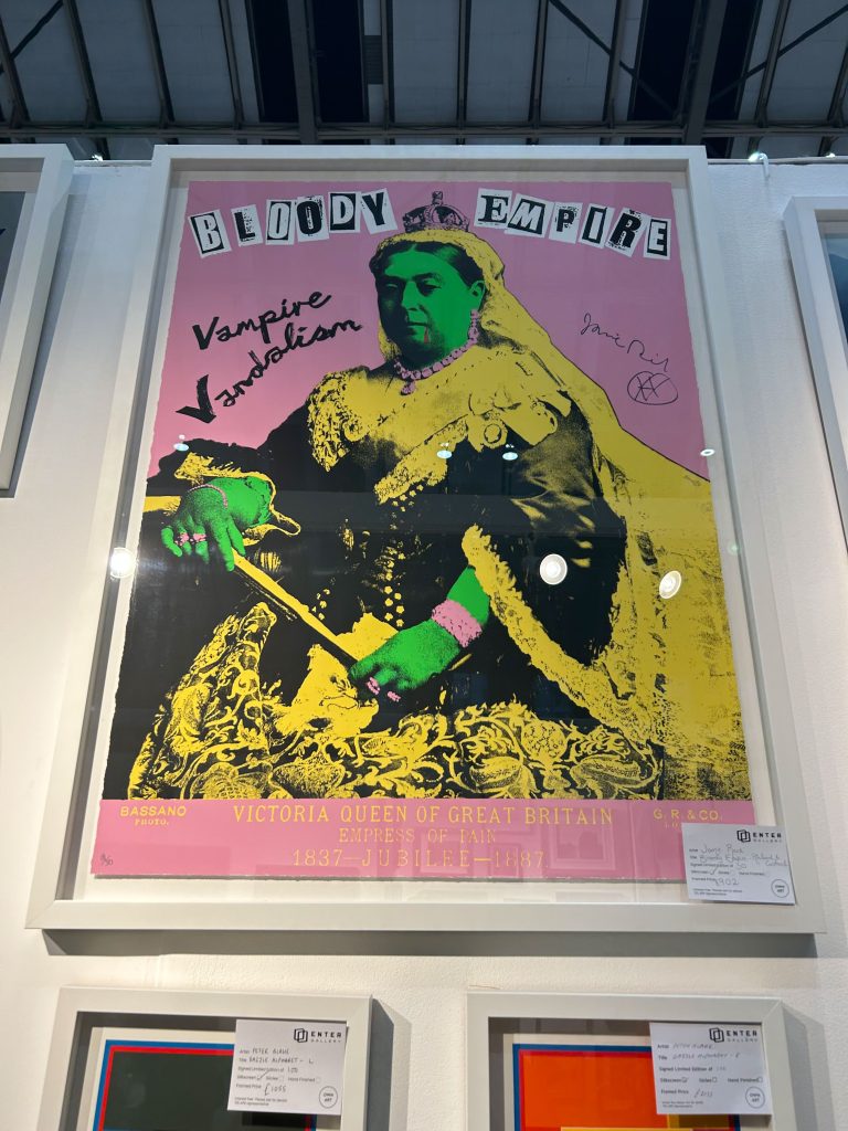
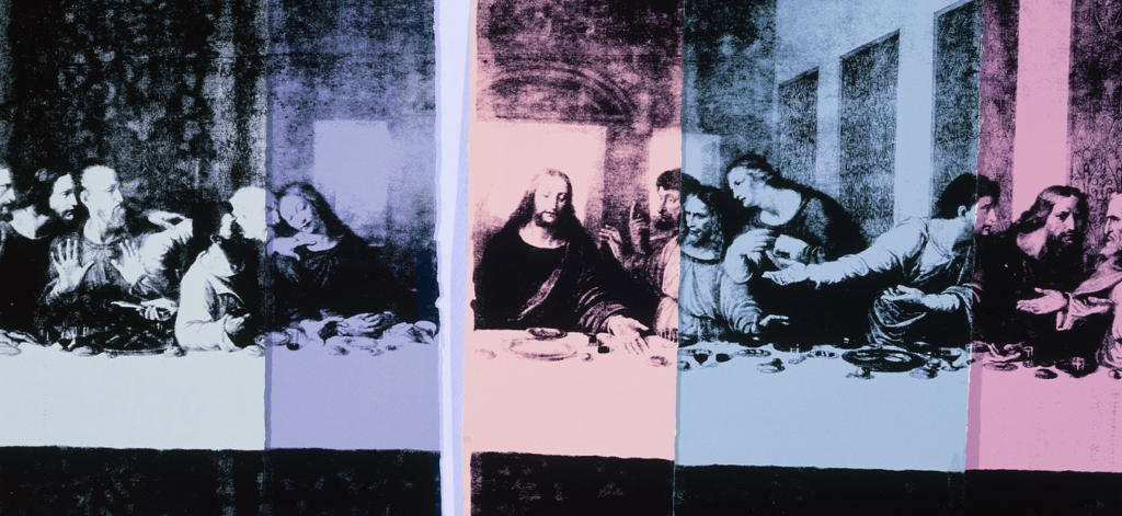
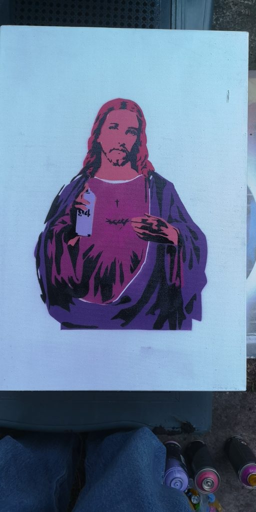
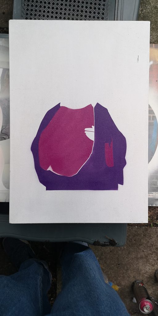
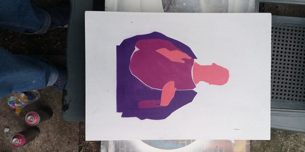
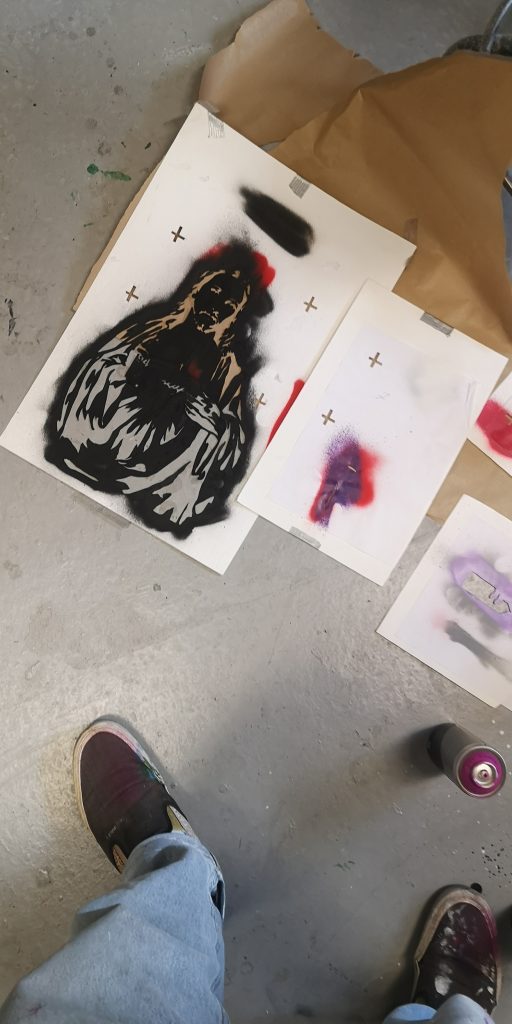
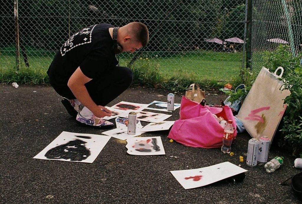
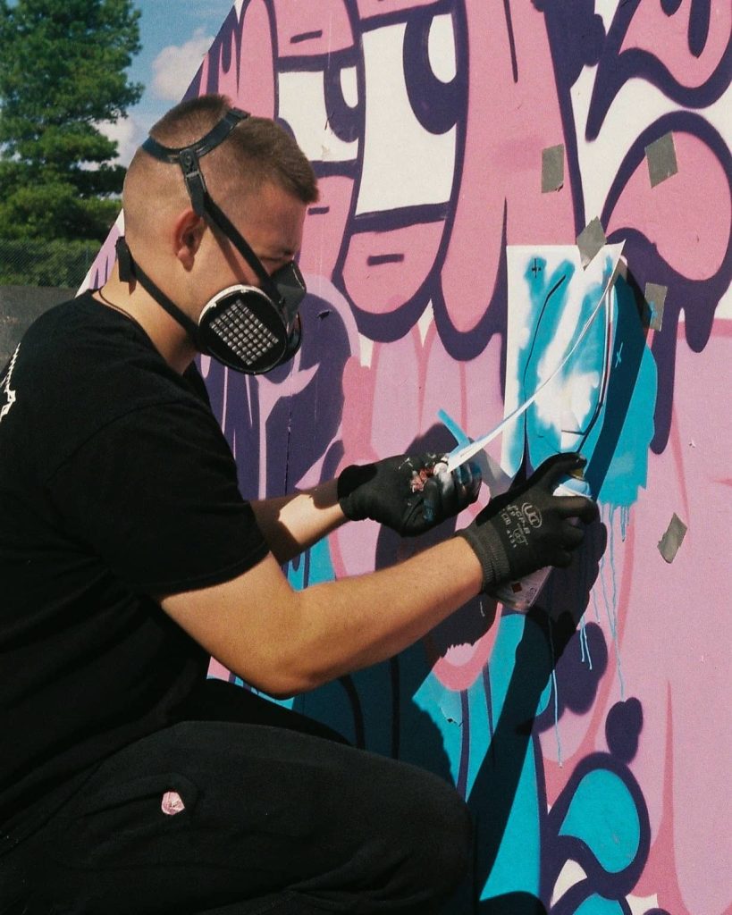
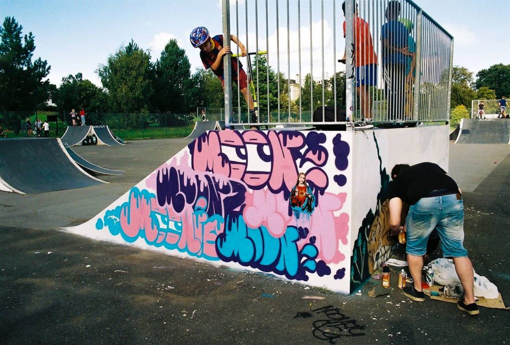
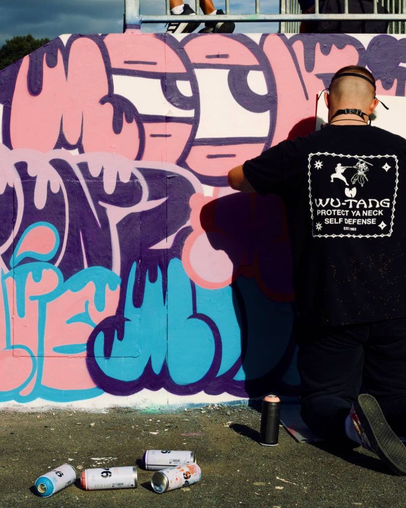
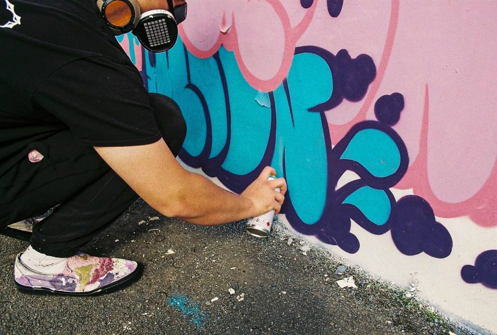
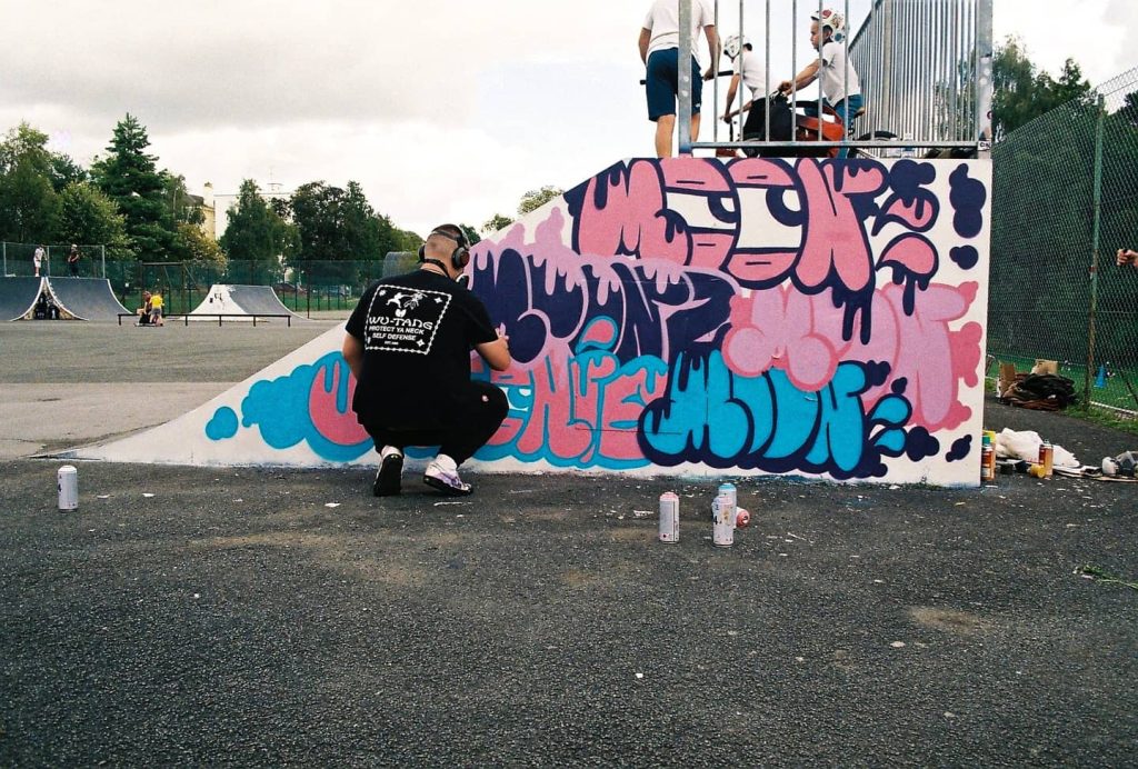
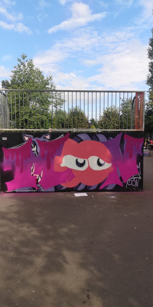
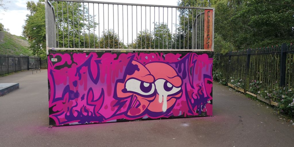
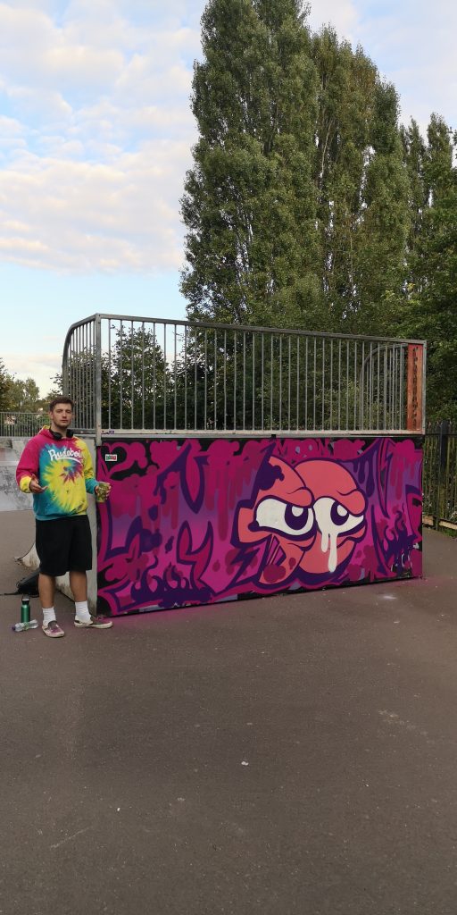
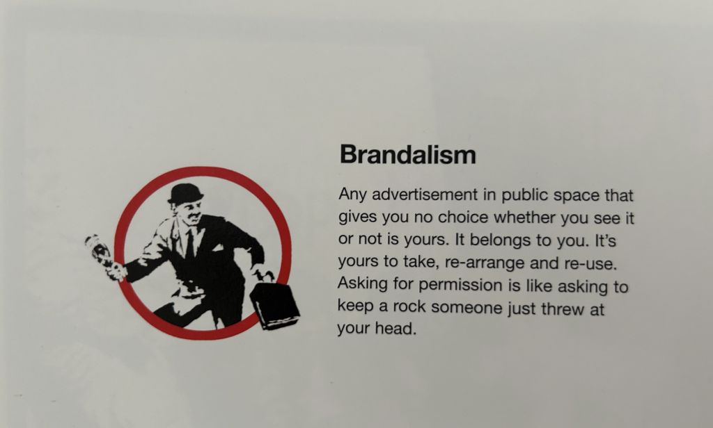
Brandalism is a term that refers to the act of subverting or appropriating advertising or branding materials for artistic or political purposes. The term is a combination of the words “brand” and “vandalism” and is often used to describe acts of street art that critique consumer culture or challenge the power of corporations. Banksy’s first major exhibition “Turf War” staged in a warehouse on Kingsland Road in London’s East End in 2003, featured this term as a central part of the show. Brandalism is a creative form of social and political commentary through creative means. By subverting the language and imagery of advertising, brandalism aims to raise awareness of the ways in which consumer culture shapes our lives and to challenge the power of corporations to control our thoughts and behaviours.

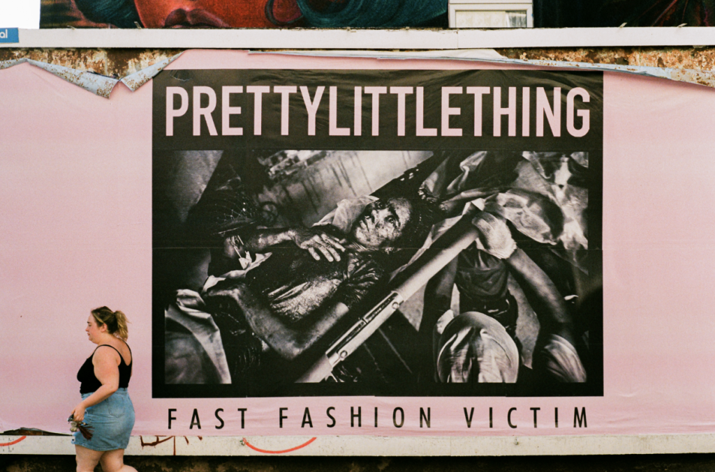
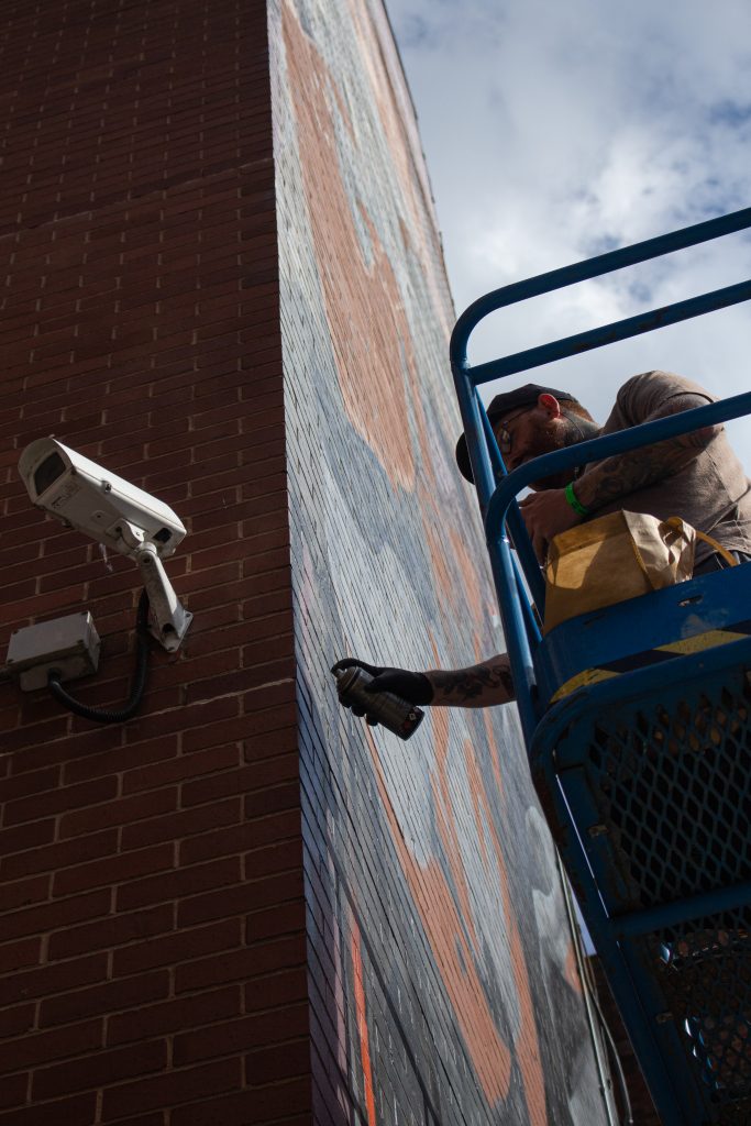
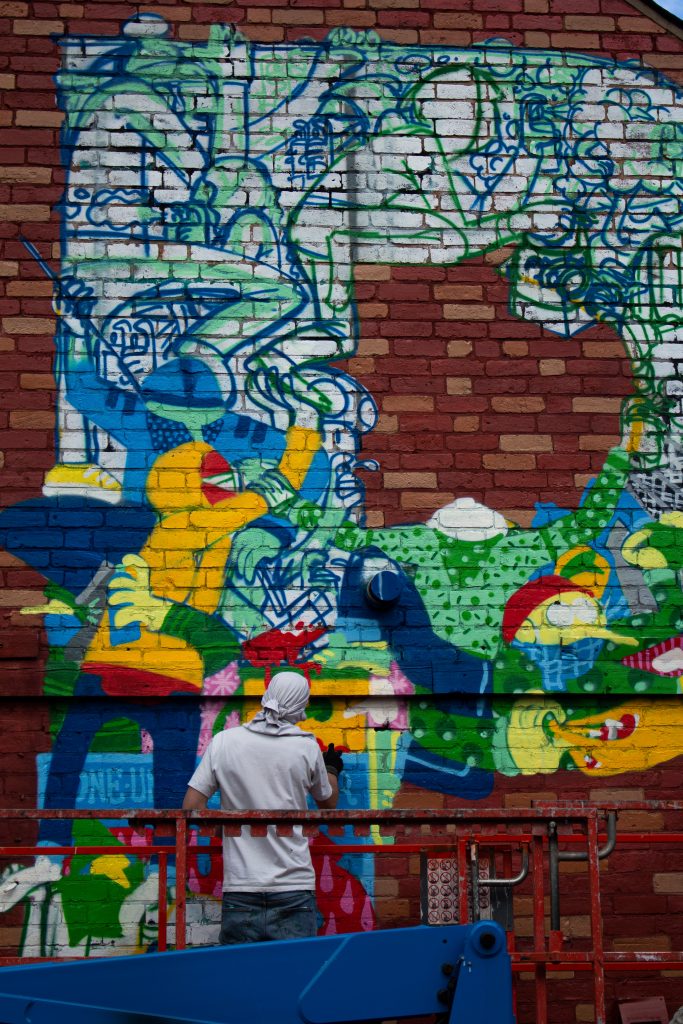
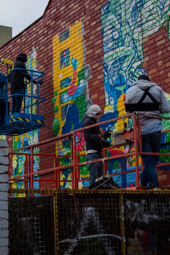
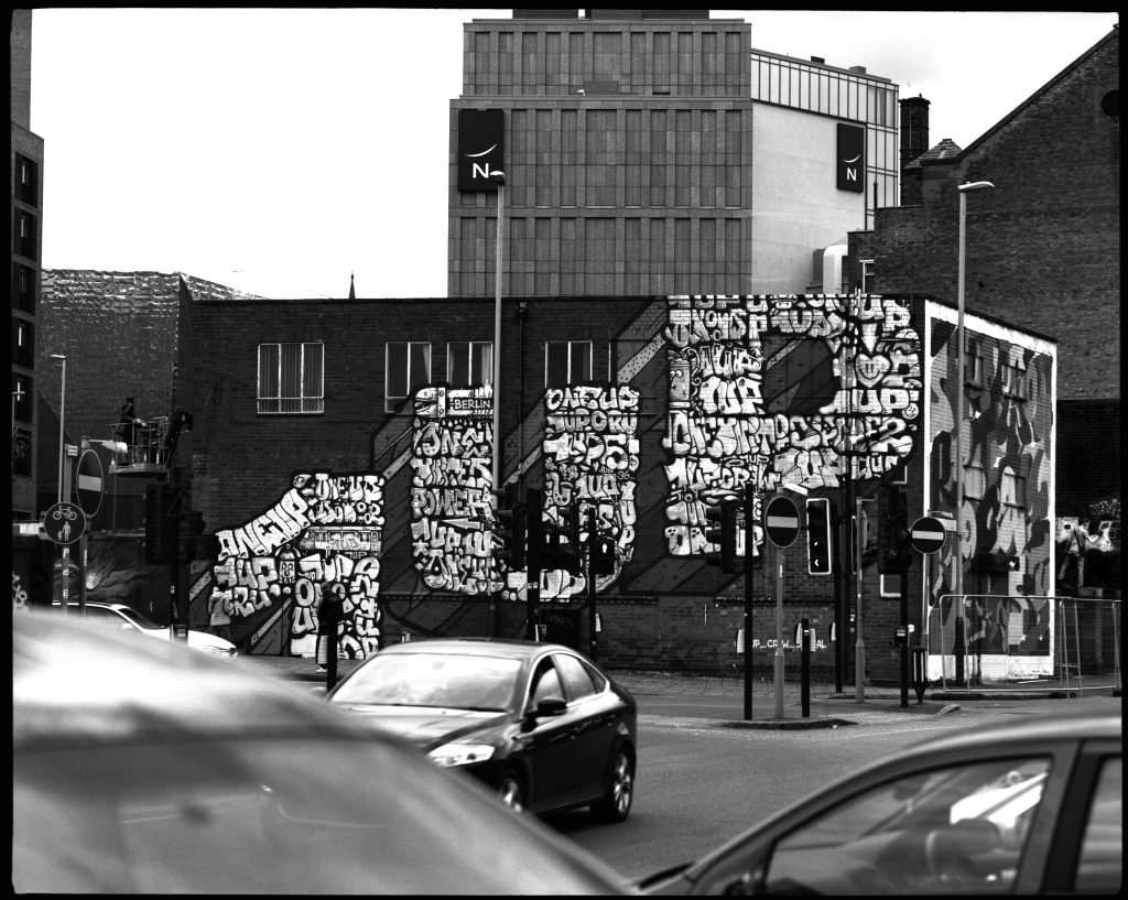
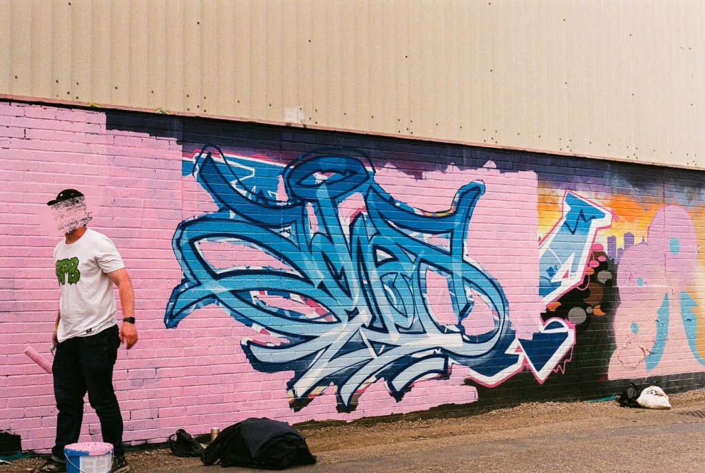
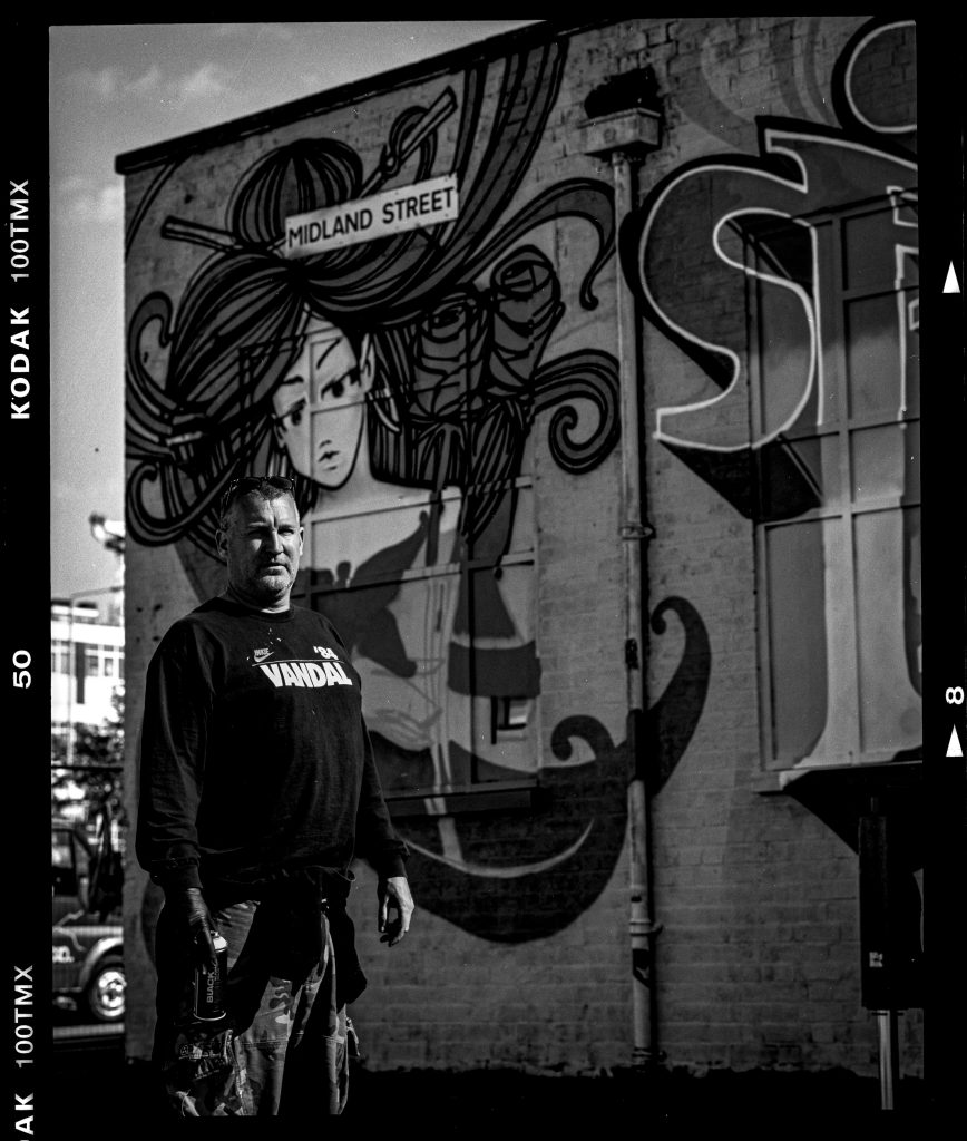
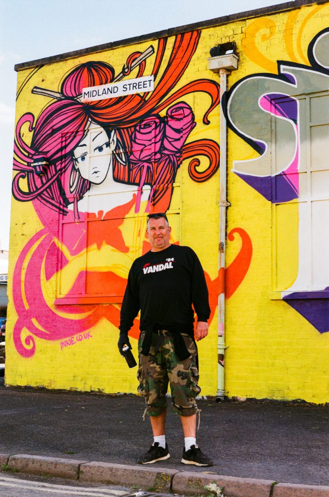
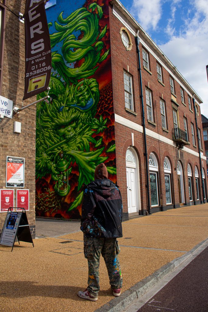
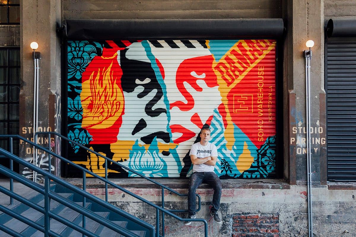
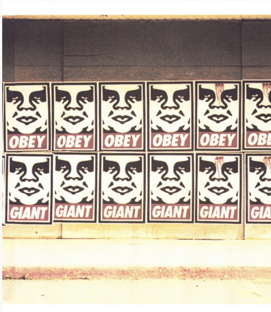
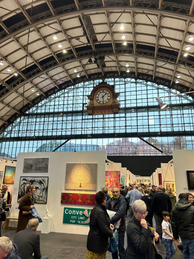
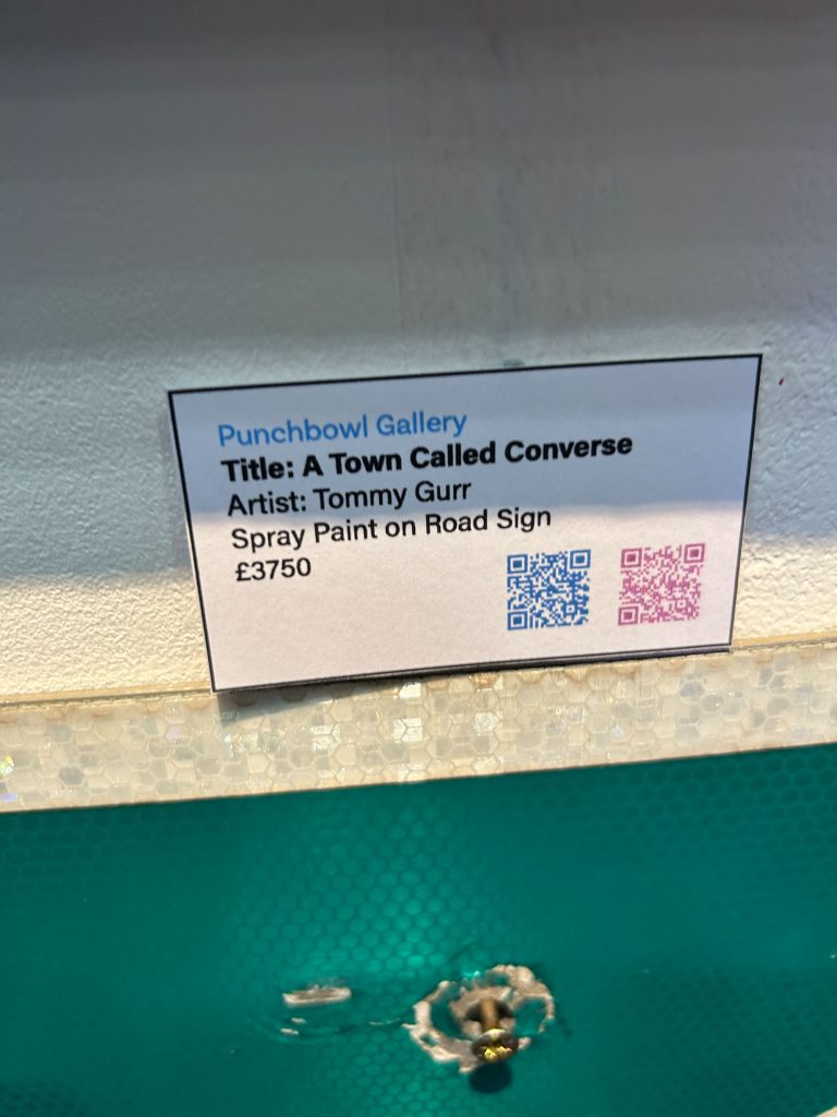
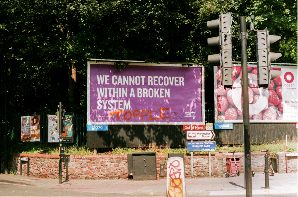
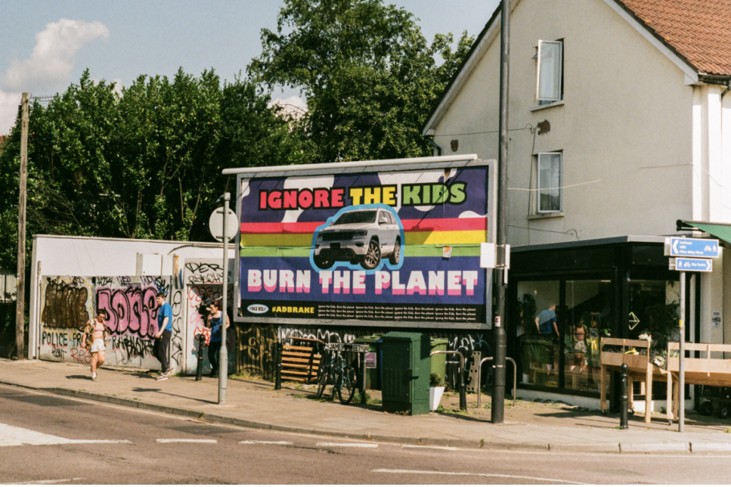
Brandalism can take many forms, including the defacing of billboards or advertisements with graffiti, the creation of fake advertisements that parody or critique corporate messaging, and the re-appropriation of corporate logos or branding materials to create new meanings or messages. It’s an act common within street art as it takes back public space through creative means. Taking back power within a community instead of letting large corporate advertising pollute the visual landscape. This is very common in areas of major cities such as Stokes Croft in Bristol. Which prides itself on its alternative and creative counter culture, being the UK’s longest independent high street. Where high push back of gentrification from the community and a heavy handed approach by police resulted in riots over tescos moving into the area. With the combination of artists, activists there brandlism can be found on most billboards in the area. This has become a key part to maintain the independent culture of the area stopping the community being dictated to by advertisement.

While brandalism is sometimes viewed as a form of vandalism or illegal activity, many artists and activists see it as a legitimate form of artistic expression and political protest. The rise of brandalism has contributed to a growing recognition of the value and importance of street art as a tool for social and political change.

https://www.charliemooney.co.uk/portfolio-collections/my-portfolio/bristol-a-visual-language

Bring the Paint

Bring the Paint is a street art festival organised by Graff HQ in Leicester. The festival was first launched in 2016 and has since become an annual event which sees international artists take to the streets to paint. I’ve been a part of the festival photographing and interacting with the artist in 2019 and again in 2022

1UP crew is one of the most prolific graffiti crews in Europe painting twice at Bring the Paint. From Berlin is crew is known for their daring efforts to assault with aerosol any wall or train they can get close enough to. This has gained them notoriety in underground graffiti culture. Little is known about the crew or how many members are a part of this due to the illegal nature of their practice.

The festival provides a platform for artists to showcase their work legally and has helped put Leicester on the map within street art. The event takes place over several days and includes talks and exhibitions at Graff Werk.

During the festival, artists are given free rein to paint on walls and buildings throughout the city this creates a vibrant and dynamic outdoor art gallery.

One of the key goals of Bring the Paint is to promote street art as a legitimate form of art and to celebrate the creativity and diversity of the global street art community. Bring the Paint is an important event for the street art community and a great opportunity for artists to showcase their work and connect with other creatives. The festival has helped to promote the importance of street art in contemporary culture and has contributed to the ongoing conversation about the role of art in public spaces.

ACHES is a Dublin-based artist who works on large-scale murals as well as contemporary studio work. Painting graffiti from a young age after getting his degree in Visual Communications, Aches fused his knowledge of Graphic Design and Graffiti. From speaking to him and seeing him paint I can understand his process and how he’s made it achievable for himself to exist in a contemporary artist role while staying true to his origins in graffiti.

Gent 48 prolific graffiti writer to come out of Birmingham. Known for his illustrative graffiti characters and lettering. Highly respected in the UK graffiti scene for his unique style and technique ability. When I first met his he was working on his next commission on his iPad while waiting for a van to move out of the way of his wall, and then proceeded to freestyle some character doodles while I photographed and illustrated the importance of can control when painting.

Inkie is a Bristol-born artist and one of the first wave of graffiti writers to paint in the UK. Began working as part of Crime Incorporated Crew in 1983. He was one of the many artists arrested in 1989 during “Operation Anderson”, the UK’s largest-ever graffiti bust. He arranged 1998’s Walls on Fire event with Banksy. One of the first legal graffiti jams in the UK. He has exhibited globally and is a pioneer in the street art scene. Known for his ‘Ink Nouveau’ style blending the traditional art nouveau with graffiti lettering and characters to create his contemporary works at large scales.

Bring the Paint is an important part of the Uk street art scene helping to legitimise street art and graffiti as key contemporary art forms. By working with artists to commission large-scale artworks instead of criminalisation of their works. This festival helps grow the community and networks of practising street artists furthering their careers as artists and helping them gain a larger audience for their works. It also shows the next generation of artists these are legitimate art forms to practice and develop a career within.

https://www.charliemooney.co.uk/portfolio-collections/my-portfolio/bring-the-paint-2019

https://www.charliemooney.co.uk/portfolio-collections/my-portfolio/bring-the-paint-2022

Hot bed press

Hot Bed Press is a printmaking studio located in Salford, Greater Manchester, UK. I first discovered them after meeting them at the Manchester Art fair. The studio was established in 1995 and has since become one of the leading printmaking facilities in the UK. Hot Bed Press offers a wide range of printmaking techniques, including screen printing, etching, relief printing, lithography, and letterpress.

One of the most popular printmaking techniques offered by Hot Bed Press is screen printing. Screen printing is a method of printing that involves pushing ink through a fine mesh screen onto paper or fabric. The process can be used to create a wide range of artwork, from posters and t-shirts to fine art prints.

At Hot Bed Press, screen printing is done by hand, using a traditional screen printing press. The process involves creating a stencil or “screen” of the image to be printed, which is then placed onto the printing press. Ink is then applied to the screen, which is pushed through the mesh onto the paper or fabric below.

Overall, Hot Bed Press is an important facility for printmakers in the UK. Its wide range of techniques and workshops provide artists with the opportunity to explore and experiment with different printmaking methods, while its commitment to traditional techniques and handmade processes ensures that the art of printmaking continues to thrive.

This is somewhere I will be accessing after my studies to insure I can continue with the print-making practices I have started over my time on the course

Barbara Kruger

Barbara Kruger is an American artist who is best known for her work in graphic design and photography. Her artwork often includes provocative slogans that challenge gender norms, consumer culture, and political ideologies. Her eye-catching graphic style would influence many artists but predominantly Shepard Fairey with the ‘obey’ brand.

Kruger was born in New Jersey in 1945, later studying at Syracuse University in the late 1960s before moving to New York City. Where she worked as a graphic designer for magazines such as Mademoiselle and House and Garden.

By the 1970s, Kruger began creating her own artwork using photographs and typography. Her works often feature black-and-white photographs overlaid with bold, red text in a simplistic but bold text font. The text is often provocative and confrontational, challenging viewers to question their own assumptions and beliefs. Using art as a powerful tool for social change and speaking out against injustice. Her understanding of advertisement can be seen within her visual language throughout her artwork. The simplicity of the visuals created, used to address much more complex topics in my opinion creates the strength of the artwork. This is also why Kruger’s work is so recognisable and easily consumed visually. Making the artwork accessible and appreciated by a mass audience without feeling lost with the message of the work.

Barbara Kruger: Artwork Survey: 1980s — Art21 | Barbara kruger, Barbara ...

Kruger’s work gained attention in the 1980s as part of the feminist art movement and the larger cultural shift towards postmodernism. Her pieces were displayed in galleries and museums across the United States and Europe. Including Tate Liverpool where I was able to appreciate the presents her work conducts when physically presented in front of you.

barbara kruger you are not yourself

Kruger has continued to produce artwork over the years building a large catalogue of work with themes that include consumerism, power structures, and identity. Her work has been exhibited in major museums such as the Museum of Modern Art in New York and the Centre Pompidou in Paris, as well as across the UK in Tate galleries.

Kruger’s bold designs and provocative slogans have made her one of the most influential artists of the past few decades, inspiring a new generation of graphic designers and artists such as myself to challenge social norms. The way I’ve been influenced by Kruger is by creating screenprints addressing the culture of graffiti seen by some conservatives and councils alike as vandalism and putting this ideology and obscured identity in a contemporary context with a satirical approach. This is through the use of the word vandalism to be provocative, questioning the native of graffiti art being vandalism. This is one of the battlegrounds faced. Linear to the battleground of the legality of the art created and the battle for graffiti to give the recognition of a visual art movement by the contemporary art world. Using the obscured female figure to address this male-dominated space. Related to how Kruger addressed the feminine form to be a battleground in her original artwork.

Shepard Fairey

Shepard Fairey at Soho Warehouse | Photo: @OBEYGIANT, Twitter

Shepard Fairey is an American street artist, graphic designer, and illustrator. He rose to notoriety for his now iconic “Obey Giant” street art in the late 80’s early 90’s. Breaking into the mainstream when he designed for Barack Obama’s 2008 presidential campaign.

Obey, da Obama a Trump, la 'speranza' è (quasi) morta: "L'arte deve ...
Andre The Giant Has A Posse | People's History Archive

In the late 1980s while studying at the Rhode Island School of Design. He initially gained recognition for his “Andre the Giant Has a Posse” which featured the image of the wrestler taken from a magazine originally mean just to create something cool between friends. Influenced by Barbara Kruger, understanding how her work was eye-catching and could make art a powerful tool to address social issues. Combined with the social commentary from the film ‘They Live’. This evolved into the “Obey Giant” which featured an updated stylized image of Andre the Giant’s face with the word “Obey” underneath. ‘They live’. The repetition of Sherpards posters comments on the idea of propaganda and social conditioning through societal norms such as advertisement.

Exhibition "COVERT TO OVERT Photography of OBEY GIANT by Jon Furlong ...

Fairey’s street art and poster designs often incorporate political and social commentary. His work consists of bold graphics with vivid colours becoming a distinctive style that is widely recognizable. His first solo show was at Stolen Space Gallery London in 2007 and continues to exhibit in London as a part of Beyond the Street at Saatchi Gallery.

Shepard Fairey’s coming from street art has managed to create a significant impact on contemporary art and design. Influencing artists and activists through his strongly politically charged artwork. He is one of the biggest artists to find commercial success from creating art in the streets. To this day he continues to work on large-scale murals, still holding the integrity of his original Obey paste-up poster.

"Power & Equality" Mural at Crush Walls, Denver - Obey Giant

"American Dreamers" by Shepard Fairey and Vhils | Photo: Jon Furlong, Obey Giant
"Legislative Influence for Sale" by Shepard Fairey | Photo: @braverphotos, Instagram

Manchester Art Fair


Manchester Art Fair is an annual event that showcases contemporary art from galleries and artists across the UK and internationally. The fair provides a platform for both established and emerging artists to showcase their work and connect with collectors and art enthusiasts. In addition to the main fair, there are a variety of events and exhibitions that take place throughout the week, including talks, workshops, and special exhibitions. This event provides the opportunity to learn more about the artists and their work, as well as engage with the broader art community.

Manchester Art Fair gave a great insight into opportunities further than the course and offered a perspective to me of galleries who are in the business of representing artists and selling their work and also showing how independent artists are out there networking creating contacts, gaining clients growing their names as an artist and ultimately funding their creative practice. 

it was good for me to see a range of artists all coming together under one roof. it really helps me see how the name of the notoriety of the artist really explodes the price of the artwork, where prints of a large addition, can sell for such a high number from the likes of Picasso and Salvador Dali. 

What are really found interesting where is the amount of street artists I recognised who had worked being sold by commercial galleries. Also, galleries, solely operate to sell, works from street artists. One of these galleries I came across was Smolensky Gallery founded in 2020 and based in Manchester. After talking with Joe Wilson, the director I found that if I tailored my work, it would definitely fit in within these gallery spaces and be commercially viable. 

Andy Warhol

Warhol is an American artist who is famous for his works from the 1960s till 1987. He invented new ways of image-making, vastly expanding what was considered fine art. Becoming a cultivator Of the pop art movement and arguably becoming one of the most recognisable artists globally. Becoming an icon himself through the notoriety of his creative process. This led him to be around a star-studded crowd where he would most famously be sighted at studio 54.

Most well-known for his creative experimentation with screen printing Working off the idea of modern American Society and iconic images within that. Warhol moved to New York City at age 21 hoping to succeed as a commercial designer. Warhol created each work with a different variety, hand-painted to mimic the uniformity of mass production. He described the canvases as “portraits”—this is an idea he explored within his work for the next 35 years.

Photography was a fundamental part of the way Warhol was able to produce his work. Photo-silk-screening is the technique where Warhol invented his signature style–a grainy black image printed repeatedly–in series, grids, rows, or pairs–on painted canvas It was an artistic breakthrough for Warhol as he had been able to legitimise the commercial method for use in fine art. Through the controversial imagery, Andy Warhol’s stemmed his creative practice around the 1960s he magnified the mass media’s worship and fascination with human suffering. As he told ARTnews in 1963, “When you see a gruesome picture over and over again, it really doesn’t have any effect.”

In 1986, he painted more than 100 works related to Leonardo da Vinci’s Last Supper, which some have read as a complex reckoning of his homosexuality, Catholicism, and mortality in response to witnessing AIDS devastated the gay community. Catholic imagery was interesting for Warhol to use as he had been brought up Catholic, being conditioned from childhood to think about God from a Catholic perspective.

Research into Andy Warhol’s screenprint processing has given me the want to learn and experiment with the process myself. I’ve already started to play around with the religious imagery making a satirical image of Jesus holding a spray can using vibrant colours such as Warhol did within his creative process. I’ve also done this using stencils to create a contemporary street art with a static to the work as Warhol has also influenced street art via his notoriety within pop art.

Julia Hadji-Stylianou – Artist Talk

A lot of Julia’s work focuses on making Connexions between identity, sense of self and places and location. Being both half British half Greek Cypriot and Julia spent a lot of her life travelling and residing between both England and Cyprus which has allowed her to draw a lot of significance to her photographic practice this idea of constant shifting from one place to another, particularly where this sense of self and identity is concerned.

‘Chasing dreams’ is the project where Julia started to explore the more fragmented state of dreams, looking into how our own identity is within dreams and how this can be slightly obscured. Julia introduced glitch art techniques starting with some long exposure portraits

 Julia used long exposures to reflect this idea of our identity being quite obscure in dreams and then started to introduce those glitch editing techniques on top of it so it’s merging photography with glitch art.

non-compos mentis

‘Non-compos mentis’ project focused more on the conscious mind unlike ‘Chasing Dreams’ focusing on the unconscious mind. Taking the plunge with self-portraiture concept inspired by Cindy Sherman and her concept of playing these various personas and characters in her disguised self-portraits. Cindy looked at identity and social role-playing. Julia also came across Francesca Woodman delving into this concept of human fragility and she created really beautiful and yet haunting self-portraits. In Julia’s project Absence and presences she talks about how a place and a location can stir memories and emotions in us. Relating this to what is called the Proust effect which is the phenomenon of reliving events and memories through sensory stimuli.

The Furlough diaries

The lockdown began and it opened a huge window of time to create artwork again for Julia. This allowed her to research other artists that were responding to the pandemic creatively and helped her create a body of work that she felt others could also relate to during this time of uncertainty. Creating The Furlough Diaries, started forcing on mundane things which had an interesting quality. This led Julia to explore her mental state and identity within this body of work as well as documenting days at home but with a focus on exploring the importance of place in relation to identity at this time. Which shows how Julia develops her photographic projects over time, through the actual making of the work.

I really enjoy the way Julia’s photographic process develops overtime as she shoots a project I think this helps to show a clear creative narrative through the body of work something that I take away from Julia’s work is how her photographic work is so strong in concept which really is the underpinning of her bodies of work which is something that I’d look to develop within my own photographic practice.

Honey Williams – Artist Talk

From Saint Anne’s in Nottingham black-dominated area of Nottingham known as the ‘ghetto’ and ‘Shottingham’ Honey was from a Jamaican family mum and dad both Jamaicans and her dad lived in Manchester in Moss Side notorious ghetto in the 80s and 90s.

Honey started getting into the music industry around university working with Ronnie size drum and bass artist who made his name in the 90s as well as Kalashnikov who’s a rapper and producer MJ Cole. Honey’s experience of the industry was it had misogyny, especially towards black females.

After University getting a degree in graphic media design and illustration for 8 years Honey didn’t draw but did set up a blog called the picky heads. it was all about ‘bigging up’ black women, hair and their skin as Honey addresses this big problem with skin tone as well as the hair texture is called colourism which most people may not be familiar with.

Eight years after University Honey started creating ‘my diary’ because Honey thought ‘I thought I better start using this again for myself because I’m gonna forget how to do it you know I’m not gonna have that same connexion to it anymore and so I started’.

Through her creative practise honey’s been asked to do many workshops with the aim of centring black women whilst making white privilege more visible to white people.

One of honey’s first commissions was by the organisation called digging deep by Norma Gregory and it was about honouring black coal miners in Britain this was in 2018 and this piece is called no joke normal. It was a workshop where people that were differently abled came together and they did the background of the piece with all that history is all behind him. Honey had about 10 minutes to put something on top so she creates the minor at about A0.

After George Floyd was murdered and the black lives matter movement blew up honey found it ‘dark’ how the amount of work came her way after that she was asked to do multiple commissions and projects as well as talks. All of a sudden people were interested in what Honey had to say. Honey felt like ‘where were you like in 2004’ ‘see it now it’s on-trend now’

Honey gained a City Arts residency which honey hadn’t heard of but they have been around all my life which gives you an idea how white they must have been because ‘no one black knew about this’. long-established now only a certain type of people knew about it and before Honey was given the residency they did a think tank with some black artists against racism and City Arts allowed them to push for a couple of hours. Saying ‘I’ve never heard of you like what have you been doing?’ Honey felt they were real with them. They change management and took it all on board. they gave Honey an art residency and this is the first time Honey feels she’s ‘produced any work for me’

One of my personal favourite works of Honey’s is ‘snakey friends’. It says end structural racism in Britain is pretty self-explanatory much like the left lying front covers it’s really layered and intricate and there’s lots of history interwoven throughout all of this.

I enjoy honey’s work and the way that she enriches the work with such historical value and power. the way that honey has been able to create positive change within the art world through her art and what it signifies I think it’s really powerful and has made me question how my own work can impact social change as well as change within the art world.

Cheltenham Paint festival

Cheltenham paint festival is an international street art festival I was lucky to be a part of through getting in contact with Andy Dice who runs the paint festival and building a relationship with him he asked me to be a part of the paint festival. I feel this was a great experience so not only get out and great my own work on the streets but also network with other artists the event was also sponsored by loop paint meaning that oil paints were provided. I was able to practise more of my graffiti style writing ‘moons’ or ‘Mooney’ To add to my graffiti I wanted to add more of a street art element so I decided to take my stencils for my ‘Jesus with a spray can’ piece adds them on top of my graffiti lettering. over the weekend I met various other street artists and graffiti writers this also helped me build up a network on my Instagram and a way for me to connect with these other artists which I met. What I also found really rewarding over the weekend was able to see people interact with my art as I was creating it I really enjoy the social elements of painting outside like this. Cheltenham paint festival is something I want to do next year as well as I feel it’s good to get known within the community when doing street art at festivals.

Roka Skate Park

Off the back of doing the Cheltenham paint festival, I spoke to my local council of Northwich Cheshire who commissioned me to repaint the dated skate park through this I was able to really experiment with my graffiti style and gain some notoriety within my local community. Off the back of this project of repainting the skate park, I spoke to my local council about pushing for legal graffiti walls so more kids from my community can enjoy this creative outlet without any legal ramifications. We are still currently in the process of working out logistics for this project but the council seem on board and happy to fund.