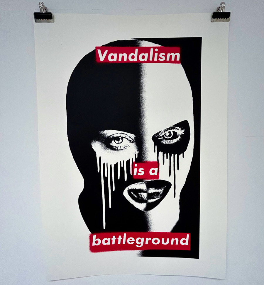
Barbara Kruger is an American artist who is best known for her work in graphic design and photography. Her artwork often includes provocative slogans that challenge gender norms, consumer culture, and political ideologies. Her eye-catching graphic style would influence many artists but predominantly Shepard Fairey with the ‘obey’ brand.
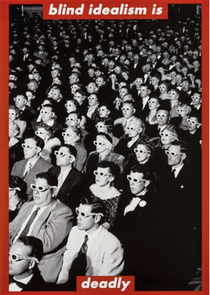
Kruger was born in New Jersey in 1945, later studying at Syracuse University in the late 1960s before moving to New York City. Where she worked as a graphic designer for magazines such as Mademoiselle and House and Garden.
By the 1970s, Kruger began creating her own artwork using photographs and typography. Her works often feature black-and-white photographs overlaid with bold, red text in a simplistic but bold text font. The text is often provocative and confrontational, challenging viewers to question their own assumptions and beliefs. Using art as a powerful tool for social change and speaking out against injustice. Her understanding of advertisement can be seen within her visual language throughout her artwork. The simplicity of the visuals created, used to address much more complex topics in my opinion creates the strength of the artwork. This is also why Kruger’s work is so recognisable and easily consumed visually. Making the artwork accessible and appreciated by a mass audience without feeling lost with the message of the work.

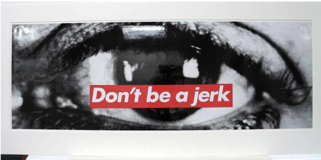
Kruger’s work gained attention in the 1980s as part of the feminist art movement and the larger cultural shift towards postmodernism. Her pieces were displayed in galleries and museums across the United States and Europe. Including Tate Liverpool where I was able to appreciate the presents her work conducts when physically presented in front of you.
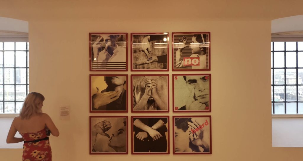

Kruger has continued to produce artwork over the years building a large catalogue of work with themes that include consumerism, power structures, and identity. Her work has been exhibited in major museums such as the Museum of Modern Art in New York and the Centre Pompidou in Paris, as well as across the UK in Tate galleries.
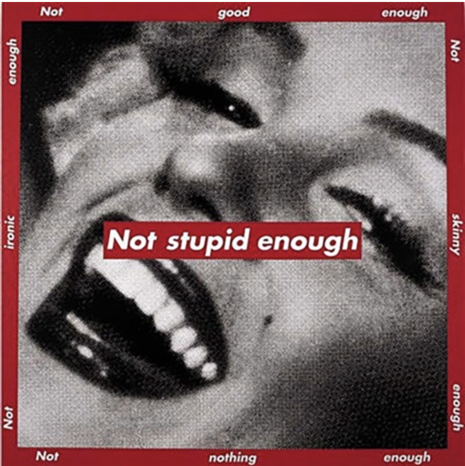
Kruger’s bold designs and provocative slogans have made her one of the most influential artists of the past few decades, inspiring a new generation of graphic designers and artists such as myself to challenge social norms. The way I’ve been influenced by Kruger is by creating screenprints addressing the culture of graffiti seen by some conservatives and councils alike as vandalism and putting this ideology and obscured identity in a contemporary context with a satirical approach. This is through the use of the word vandalism to be provocative, questioning the native of graffiti art being vandalism. This is one of the battlegrounds faced. Linear to the battleground of the legality of the art created and the battle for graffiti to give the recognition of a visual art movement by the contemporary art world. Using the obscured female figure to address this male-dominated space. Related to how Kruger addressed the feminine form to be a battleground in her original artwork.
