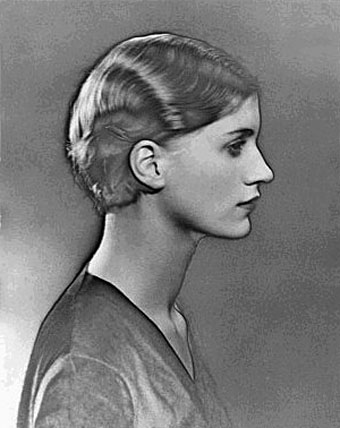
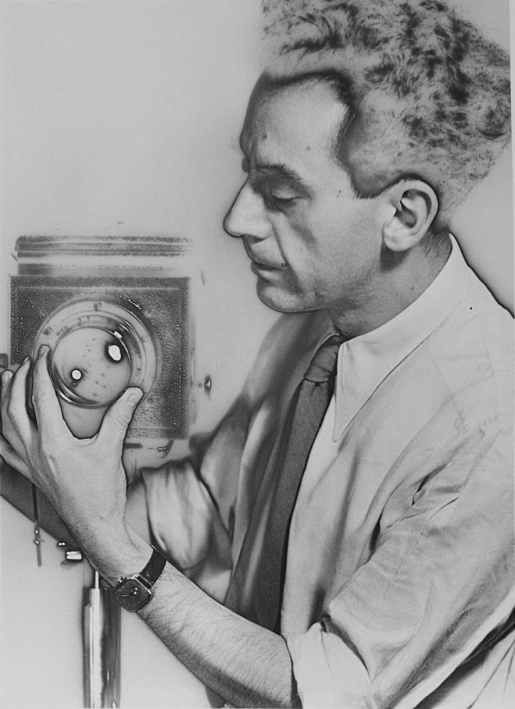
I really enjoyed these images that Man Ray created within his darkroom practice after seeing these I learned that the process is called solarisation and from that, I went to the darkroom to experiment and understand the process for myself.
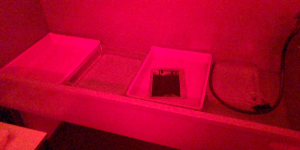
This is an image of the setup I had in the darkroom so I was processing by hand using the different trays of developer fixed and stop as the image would start to develop in the first tray I would say get back out and run to a light that I had set up on one of the enlargers to expose the image before placing it back in to develop it more and then having to leave to hand drive for 24 hours before digitally scanning them so I had a digital copy as well as the actual physical one.
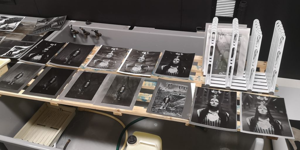
This was the result of my experimentation of the darkroom of using solarisation
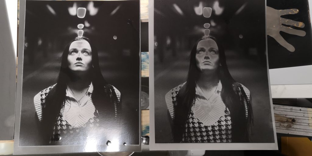
I started to understand how if I change the variables of the amount of lights or how long I left it in the developer it would change the contrast and how much effect the solarisation took.
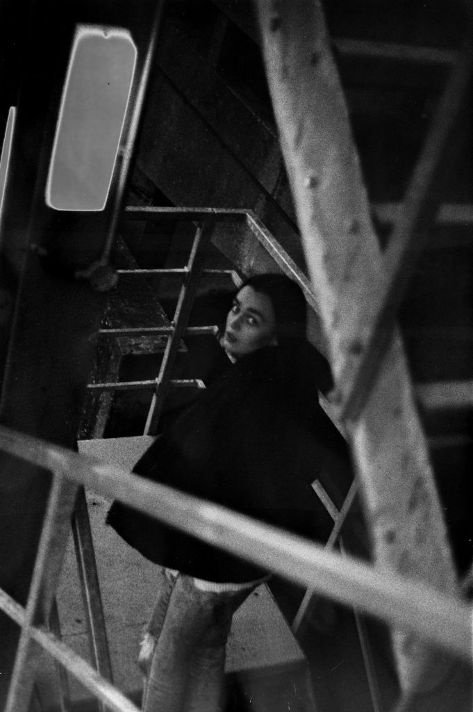
With this image I’m really happy with the subtleties but the solarisation as really what it did was just create more contrast in the image which I felt complimented it when taking this image and moved ahead of the model thought about my composition and as she was walking up the stairs I shouted her name so she turned around and that’s when I took the shot in that moment so it had this candid quality to it and I feel it’s come out so well because she had no prior thought of how is she going to present herself in front of the camera just a very natural representation.
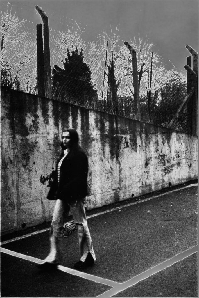
With this image I really love the texture the feeling of movement from the model the way there’s a slight blur so the focus isn’t massively on her but it still captured the essence of a person in the image creating scale I feel this solarisation is where it really effectively on the sky as it’s very clear that the sky doesn’t naturally look like that it’s created a lot more contrast within the wall and I personally enjoy the bleed of the white lines on the floor onto the photographic paper because that’s something that happens when using these process is and to me, it shows that it’s been hand-processed because it is very difficult to digitally manipulate something like that because it’s so natural the way it’s been produced.
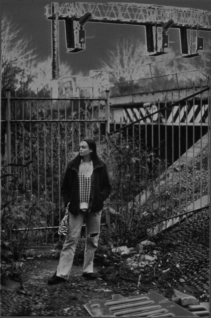
Again with this one I feel the solar as I solarisation worked well within the shot itself there’s a lot of reoccurring patterns tying the model in the foreground to the background grounding her in her setting the solarisation is only helps emphasise this through the colours and shades which it’s pulled out of the image this is one of my personal favourites.
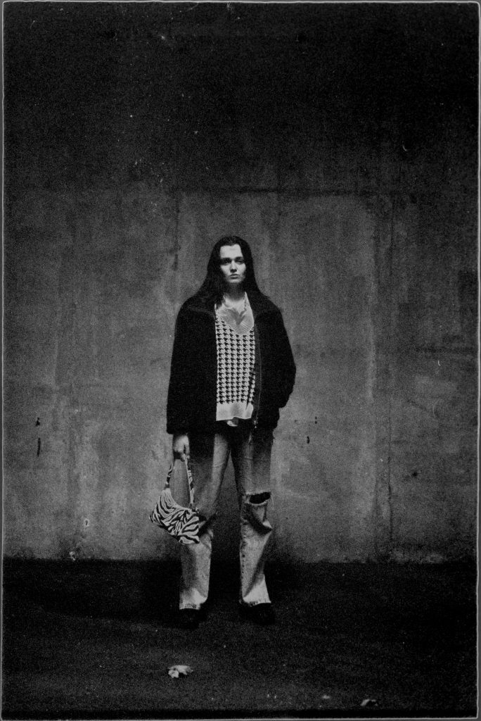
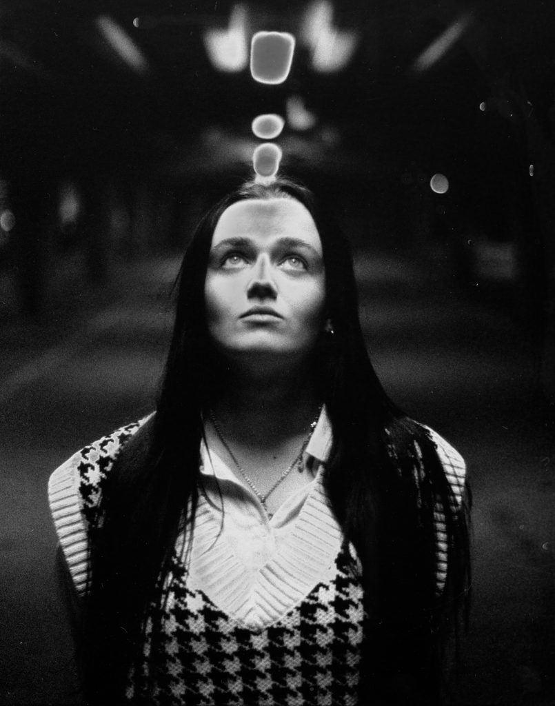
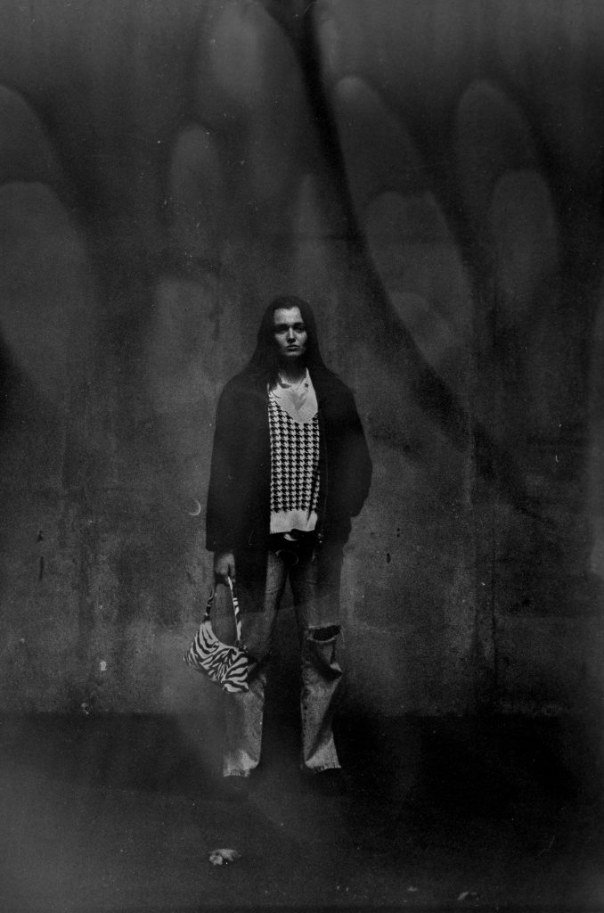
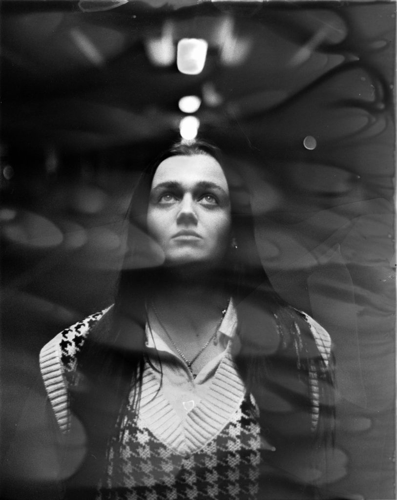
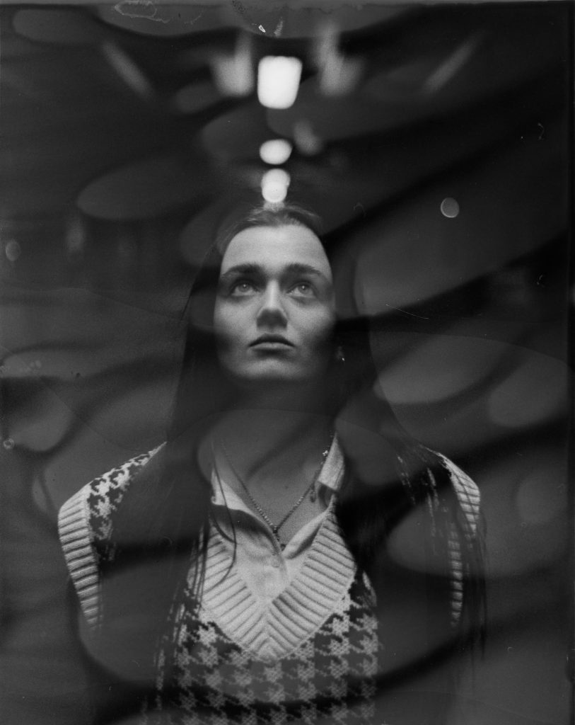
I started to discover if I experimented with the way I was hand processing the images in the developer I could create a texture on top of the image while it was still exposing creating different shapes and layers of contrast within the image which I found really interesting I really felt like this was taking the experimentation within solarisation a step further as this wasn’t pre-planned it was just a development while working with the process.
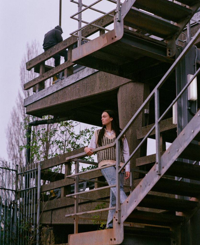
I also shot medium format colour film Which are then sent off to a lab to be processed I’m happy with the results which came back as I feel they work effectively. with this first image I really love the composition the symmetry within the building edgy the guy sat on the edge I feel really adds the image even though he had nothing to do with me I waited for him to look in this angle because I thought our use is to my advantage instead of waiting him to leave or asking him to leave for the shot and it creates a dialogue of who is this person why they sat there as they almost become a part of the environment themselves or products of it so to speak and it doesn’t detract any attention away from the model who is the primary focus of the image.
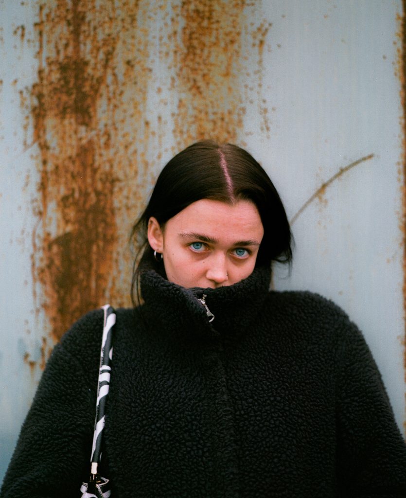
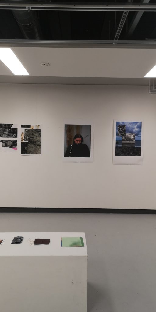
I really love how strong this portrait is there’s such an emphasis on the eyes which creates a dynamic between the image and the viewer the way her mouth is hidden in the jacket creates this solve mystery and distance with the juxtaposition if the eyes pulling you in I really enjoy the texture in the background I think it’s worked as a great backdrop and doesn’t pull focus from the model whatsoever. with this being a strong portrait I decided to print it at A2 and exhibit this as I feel in more of a gallery setting it really will catch people’s eye because of the direct contact created through the lens.
