HOW TO ANALYSE AN ART WORK.
An analysis is looking at all of the different components of the art work, considering what they mean, how the artists used them, and/or what the artists intention is and what the viewers response would be. This also requires putting the artwork in context, understanding what ideas or artists influenced the work of art.
Firstly answer the questions up to 6 here,
- Formal analysis:
Colour: is it bright, dull, primary, pastel, natural, synthetic?
Form: abstract, geometrical, curvilinear, organic, repeated
Tone: dark, light
Size: massive, tiny, human
Materials: what is it made from, and how does this impact the work?
Shape: is it on a canvas, or cut out on the floor?
Composition: dynamic, straight, narrative
- How is it installed, is it an installation, a video, is it projected, is it curated?
- Are there any visual clues, symbols or recognisable objects in the work?
- Can you decipher any meaning? What is it trying to say?
- What type of work is it, is it a painting, mixed media, a sculpture, video, photograph etc.
- From looking at the work does the work fit into a period of art, or part of a wider group of artists?
- What other works of art influenced the artwork, what does it look similar too?
Use the internet to help answer the following questions
- What is the context for the work of art, is it inspired by history, politics, changes to art in society, the use of new materials, a development of a new technique of art.
- Did anyone important write about the work, or did the artist write about the work, find interviews or articles.
- Was the artwork in any important shows?
- What period of time and history is the work from?
Analyse an Artwork
| Artist: | Title: | Date |
| Colour: | Form: | Tone: |
| Materials: | Shape: | Composition: |
| Installation: | Symbols: | Medium: |
| Does it look like any other art you know? | Is it from a group or period of art? | What is it trying to say? |
| Context: | Writing (links) | Shows: |
| Personal response: |

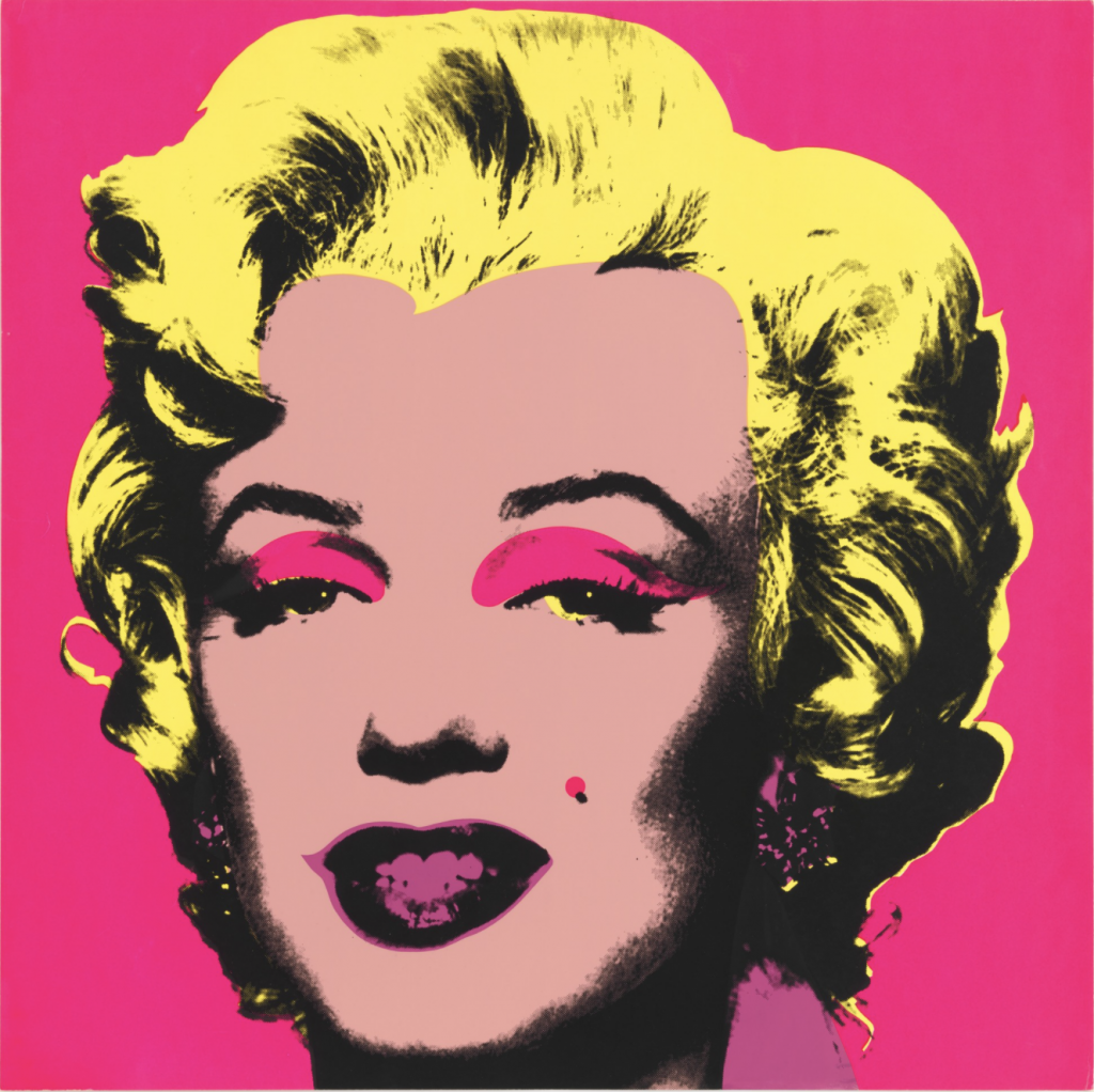
Andy Warhol Untitled from Marilyn Monroe 1967
Bright vibrant bold colours yellow and pink shades used block format to create contrast. Layered on top this colour pallet is a jet black tone which creates the iconic pop art look. The form is a truthful depiction of the subject which contrasts with the abstract use of colour. Created using screen-print on canvas. Drawings were reproduced and then hand coloured.
The piece is 91.5 x 91.5 cm and was published at Factory additions New York. Printed at Aetna Silkscreen products, Inc, New York. The work hands in the Museum of Modern Art. Andy Warhol was at the pinnacle of the art world in the 60s this piece was created in 1967. Pop art style changed the narrative of the art world and in the early ’60s. Andy Warhol received a lot of criticism for his work before he became an art icon within himself. Warhol’s artwork was so heavily based on popular American culture and icons. Marilyn Monroe was highly sought after actress at the time of this piece was created. The composition focuses in on just the head cutting any other context out of the picture. My personal response to why Warhol made this creative decision is he was making a comment on the idea of her being an icon and the way the focus was so intensely focused on her. The colours used in my opinion have been used to further this idea of focus on her as its so jolting to the human eye can’t help but look at the piece. It’s unavoidable. This emulates the way Marilyn Monroe was unavoidable in American culture around the time this piece was originally created. Andy Warhol changed art not only American culture but western culture. His art and the pop art movement became American culture and Andy Warhol himself became an icon in his own right because of that.